Redesigning a design app and making tools for prototyping.
For some of these past few case studies, I have been familiarizing myself with Adobe XD, a UI/UX design software developed by the same company as Photoshop and Illustrator. However, surprisingly, I came across a few issues, including some cross-application inconsistencies and poor accessibility.
REDESIGNING
Don't sacrifice accessibility for minimalism.
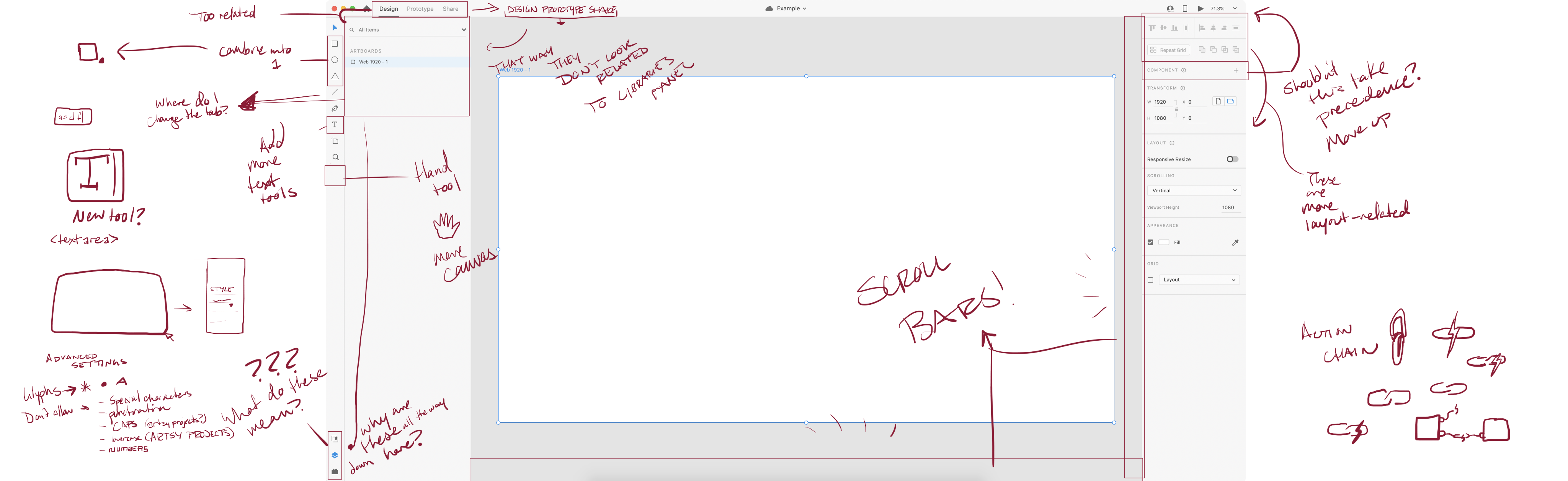
My first observation for the app was that there weren't any scroll bars for the canvas. Shortcuts are nice to know, but they're not readily intuitive for new users, and learning the app can be daunting if users need to search how to do seemingly simple tasks. So, I added scroll bars and a hand tool, which are used in other Adobe applications. Offering these different options not only contribute to cross-application consistency, but they also provide accessibility if the user can't use the shortcut (space + drag).


Maintaining Consistency
XD doesn't look quite like the other Adobe apps. Long-time users of Photoshop and Illustrator may be confused about how to add a star or a polygon. So, I combined all the shape tools into one shape tool, which allows for several options, similar to how it's done in Illustrator. I also incorporated text tools the same way.
Improving Proximity
Some elements feel detached from their respective contents. For instance, the three buttons for Library, Layers and Plugins are all the way at the bottom, but their contents are to the right and aligned towards the top, making quite a leap from tab to content. So, I moved these buttons into a tab system, where the content is directly below the tab.
I also replaced the icons with text for easier deciphering. Although the icons have a sleek and minimal design, they are too similar in shape, so users may take a bit longer to process what these icons represent.
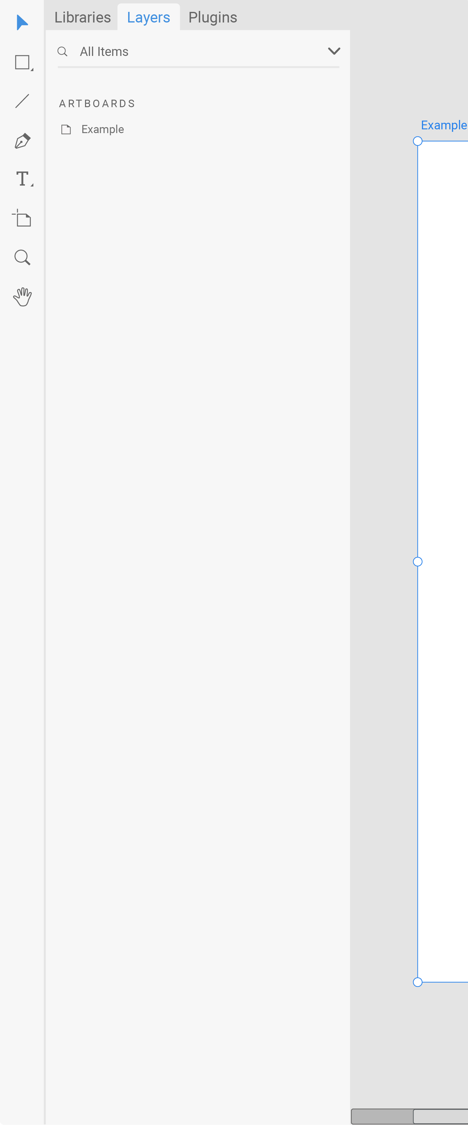
I also shifted the Design/Prototype/Share buttons closer to the canvas because they affect the canvas mode and should not be confused with the tab menus.
Adjusting Hierarchy
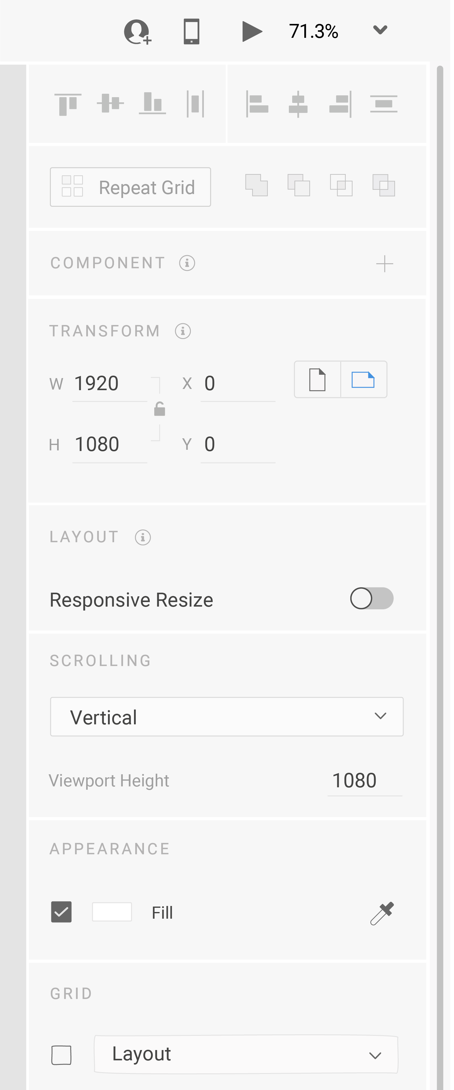
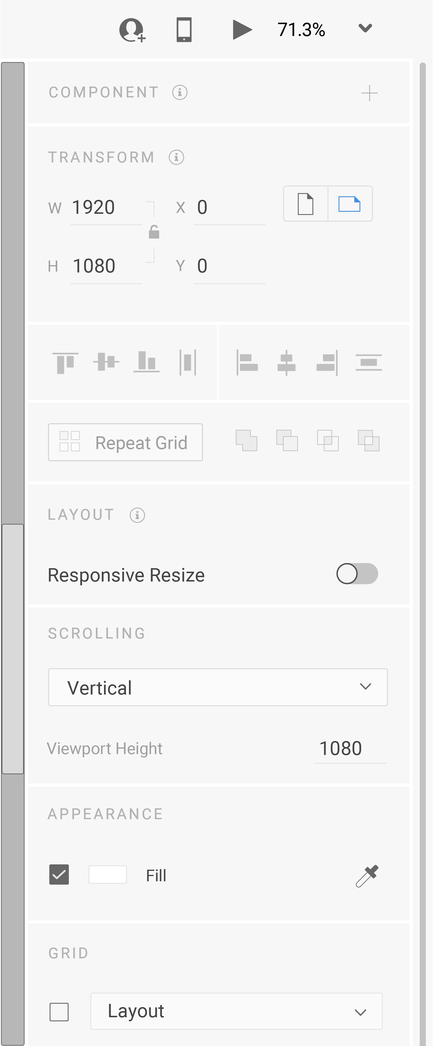
Along with adjusting proximity, in the right toolbar, I have adjusted the hierarchy of elements to better suit their relationships. Component is now at the top so it appears less arbitrary and has precedence over the rest of the tools. The Align and Repeat Grid tools are in-between Transform and Layout because these formatting tools are more closely related.
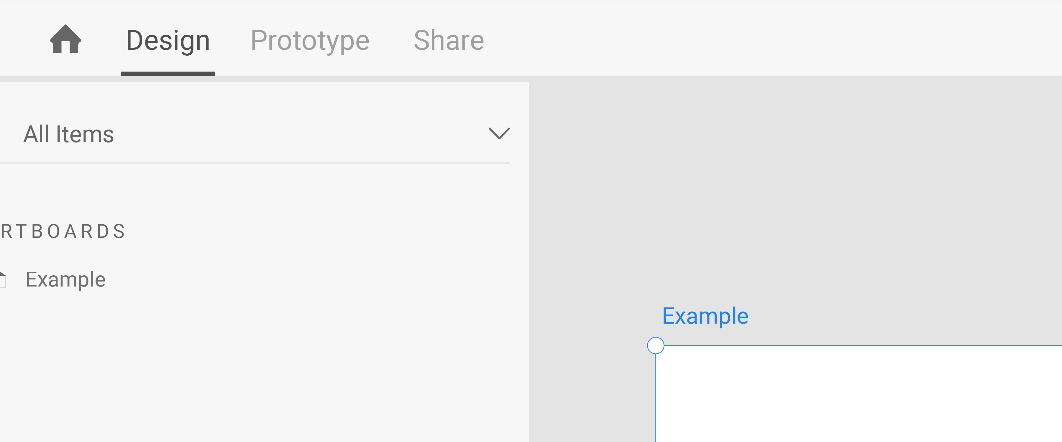
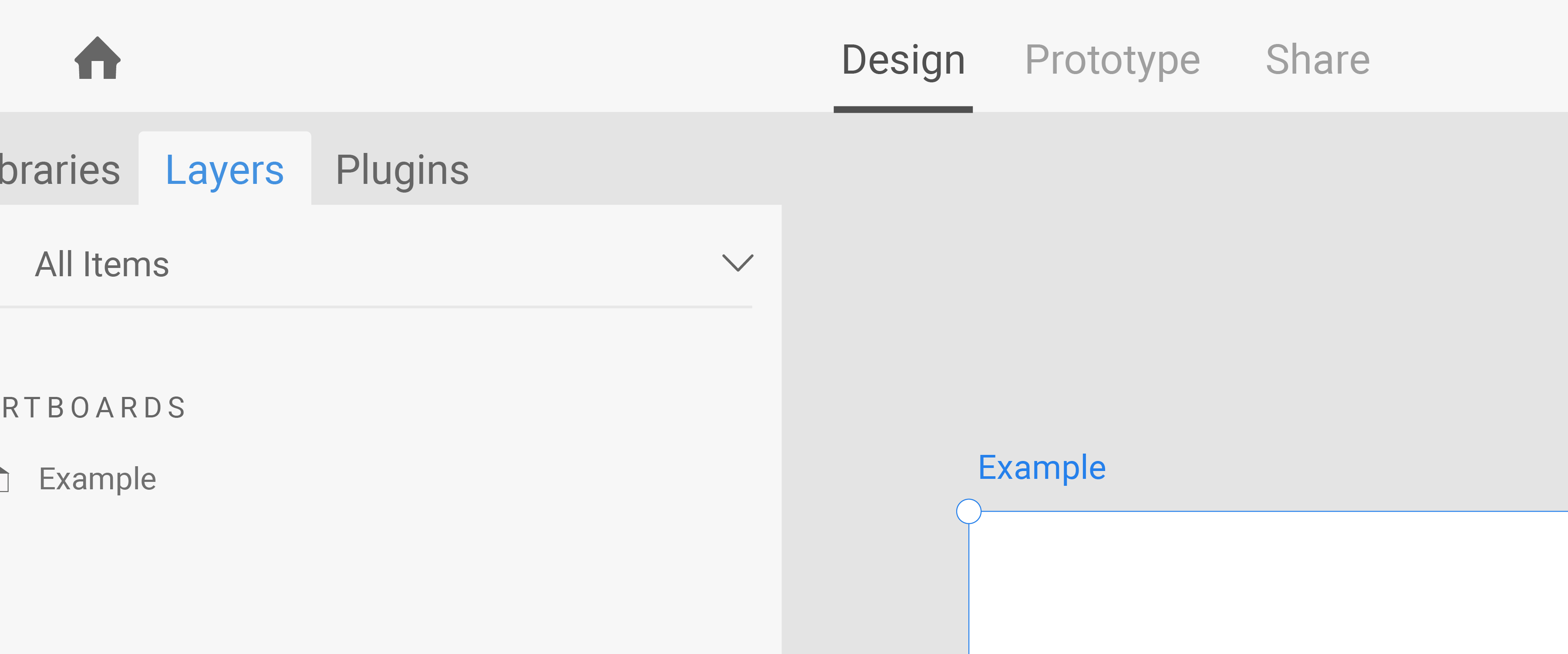
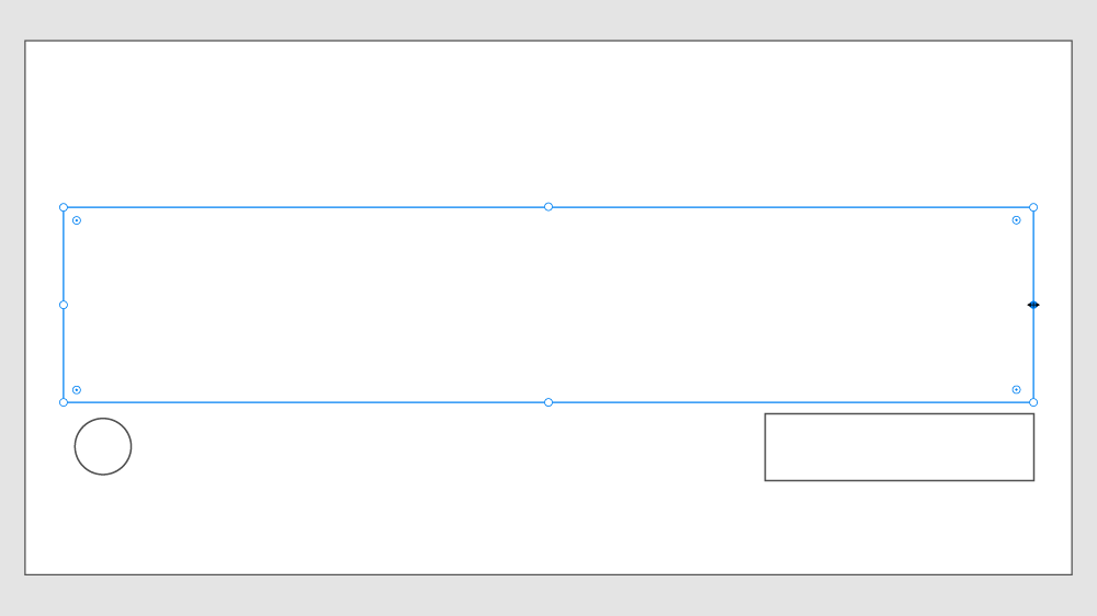
Current UI Comparison


Drag the slider to see the UI comparison between the original design and the redesign.
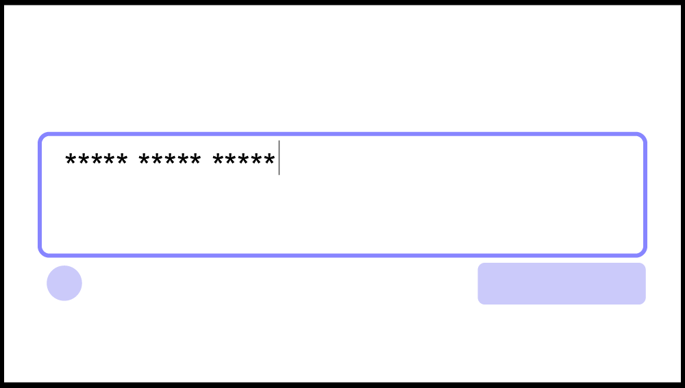
Text Area
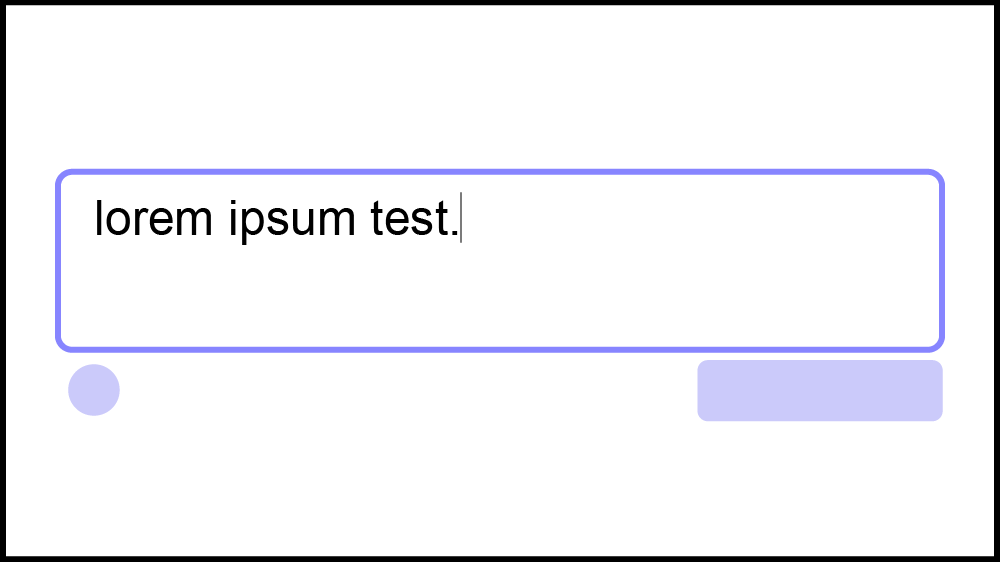
New Feature: Text Area
So far, XD only has one static text tool, so I decided to create a Text Area tool. The Text Area would act like the HTML <textarea> input, which allows users to type in a box. This feature would be a great tool for prototyping comment sections, login pages, social media posts, or other user-writable elements.

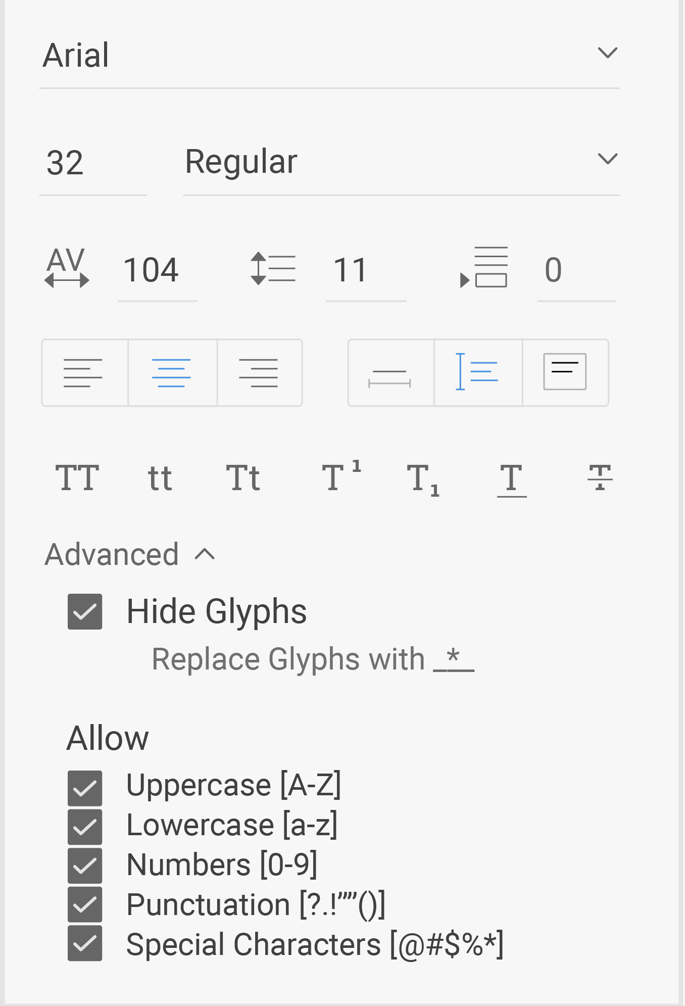
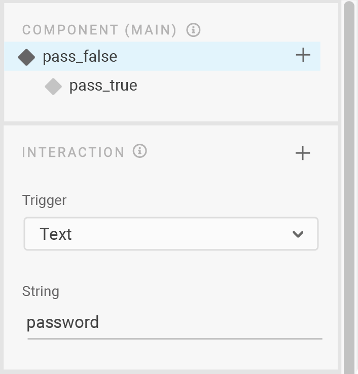
Creating Realistic Experiences
Along with letting users type in the stylized text box, the designer can use advanced settings to affect the type of text that's written. This would be a plus for designing forms, especially to show if passwords hide glyphs or if phone numbers only accept numbers.
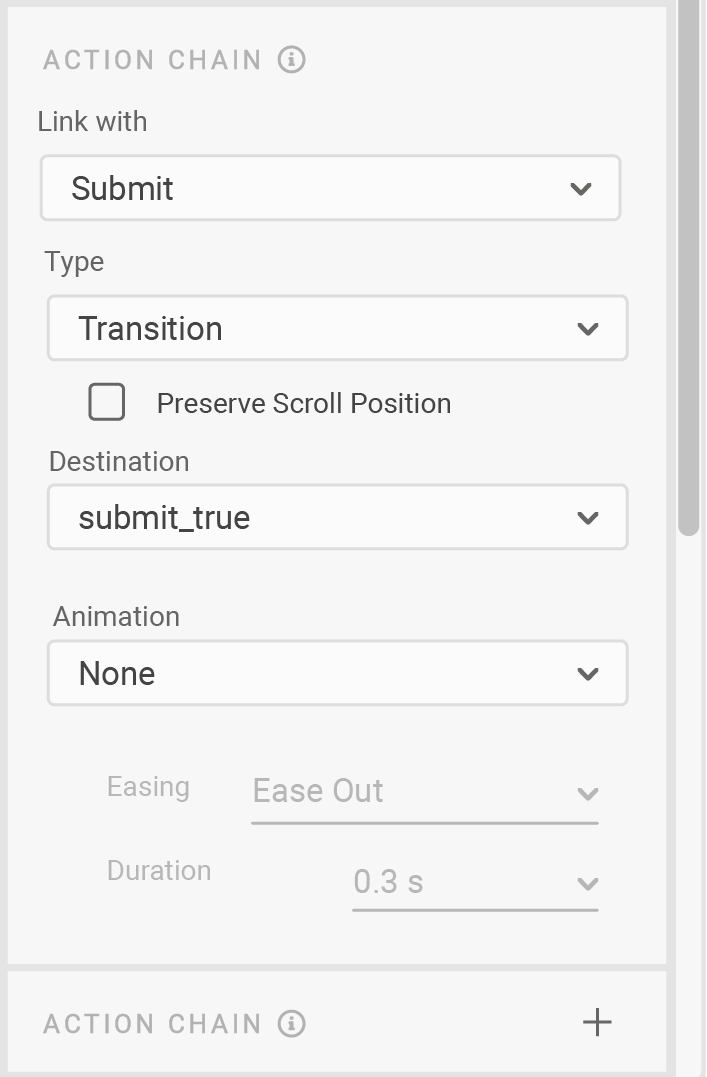
Action Chain

XD users want to showcase more interactive prototypes, but the current software is restrictive and only offers simple state changing. Based on the language and style of XD's state changing, I designed an "Action Chain" solution.
Mapping the Goal
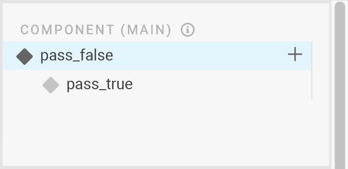
In XD, there are Components, States, and Actions. Users can assign an Action to a Component to change its State. But, that Action can only affect that particular Component.
UX designers want to be able to affect the States of multiple Components through one Action. This is necessary for prototyping interactive pages, like login forms.
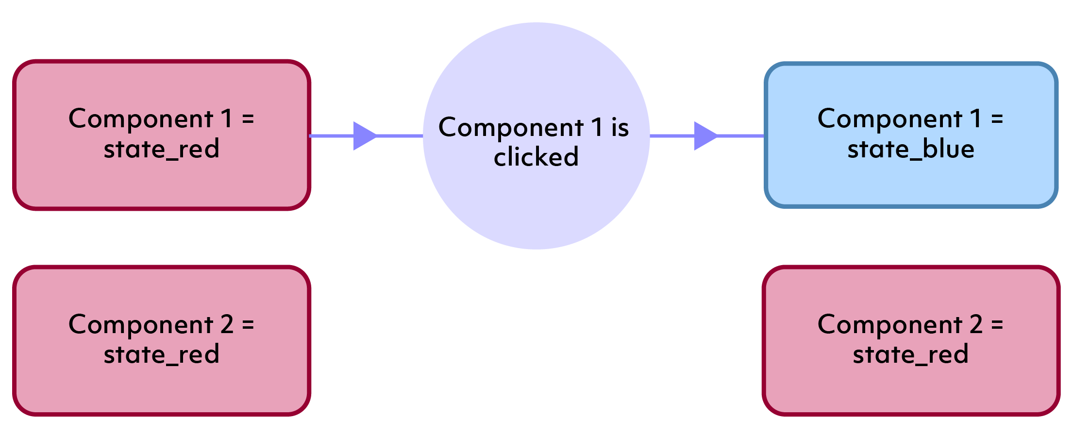
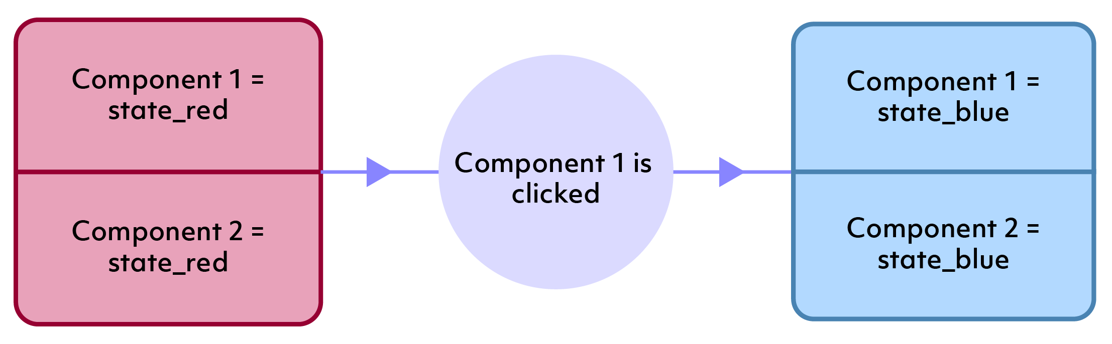
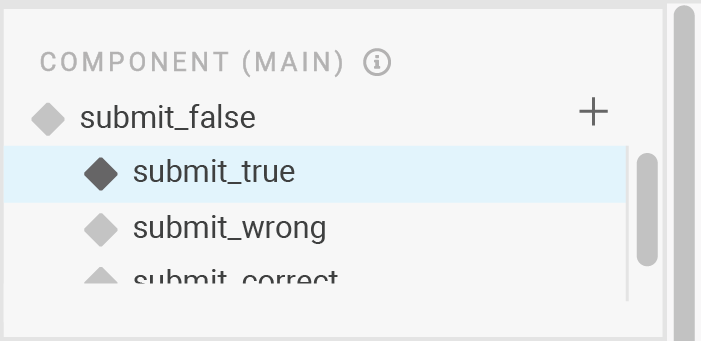
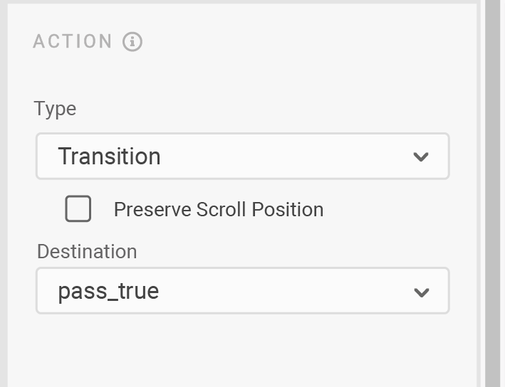
New Feature: Action Chain
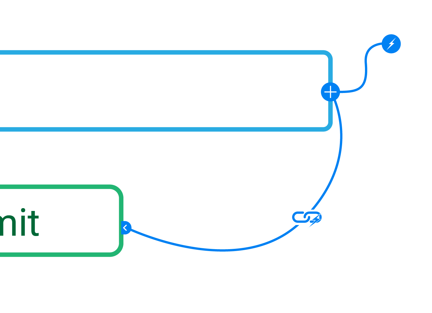
Based on the current action assignment model, I decided to add a chain-reaction section to XD's prototyping area. Users can assign an Action and State change to the Component, then link other Components and their desired State changes.
Login Example
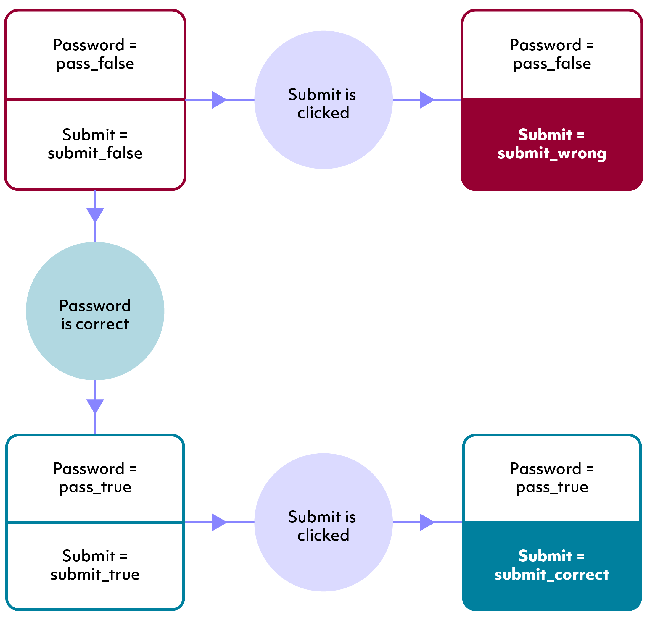
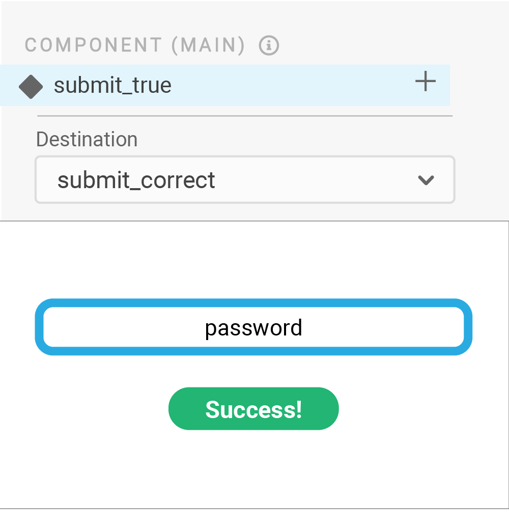
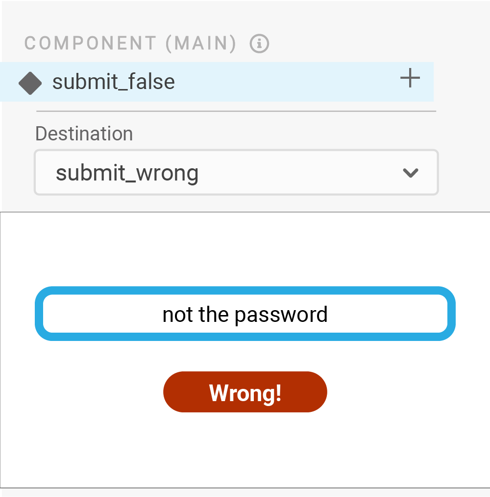
In-Depth Example
This more in-depth interactive example shows how the different components and states can be affected through the Action Chain. Try it out!
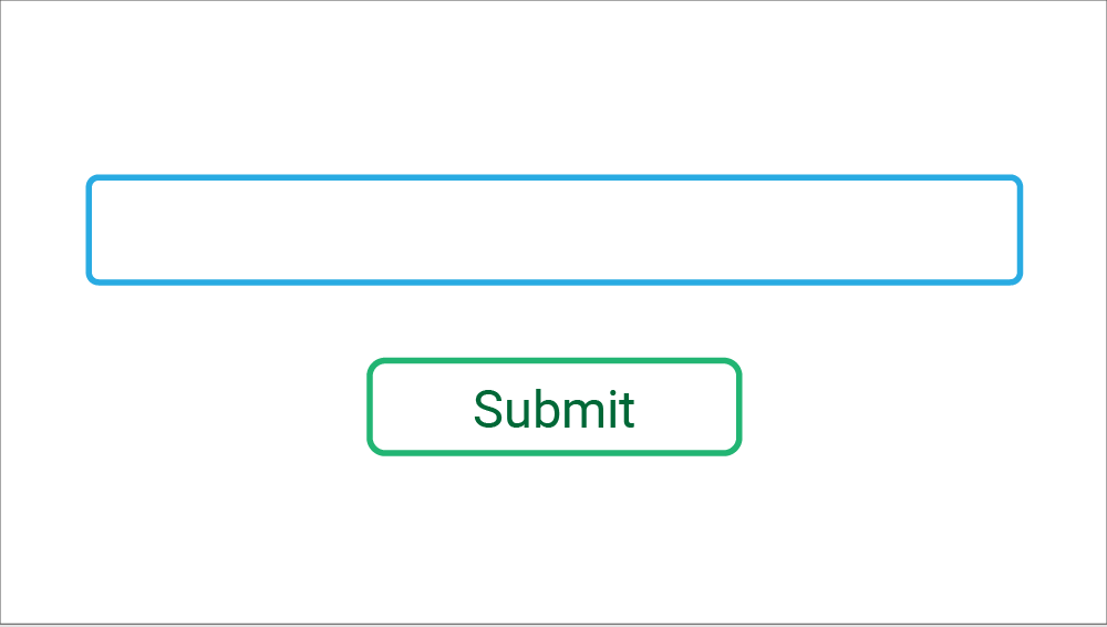
Login
Click to interact with the example login

Phew!
Nothing quite like creating a tutorial for a hypothetical tool-- especially one that's set up in the application's particular method!
But, overall, this Action Chain feature would:
- Be more efficient, greatly reducing the space needed for a single project. For instance, the login screen currently needs 8 artboards to display miniscule changes, but Action Chain could reduce that to 1 or 2 artboards.
- Reduce the time it takes to design one page. No need for extra copying and pasting, designing each possible outcome, or sifting through tons of artboards for the right page.
- Increase the level of interactivity in prototypes, letting users have a more in-depth planning experience.
Adobe XD
Adobe XD is a nice design tool, but it can prove to be even more powerful with increased interactivity, along with some minor redesigns to improve accessibility and consistency. Overall, it was a fun challenge to redesign a design app.

This project uses copyrighted material in an effort to accurately portray a possible redesign of Adobe XD. This project is protected by Fair Use under Section 107 of the Copyright Act, in that the project is for educational purposes through practicing and improving design, and the project also offers critical analysis of an existing application. This project does not intend to profit from any of the copyrighted material from Adobe or its affiliates.
Well, maybe that last comment was a bit angry, but the message is loud and clear: users want to incorporate writable text blocks into their designs so their prototypes can be more interactive.