Inconsistencies, difficult to read content, lack of branding... Disney's site needs some redesign.
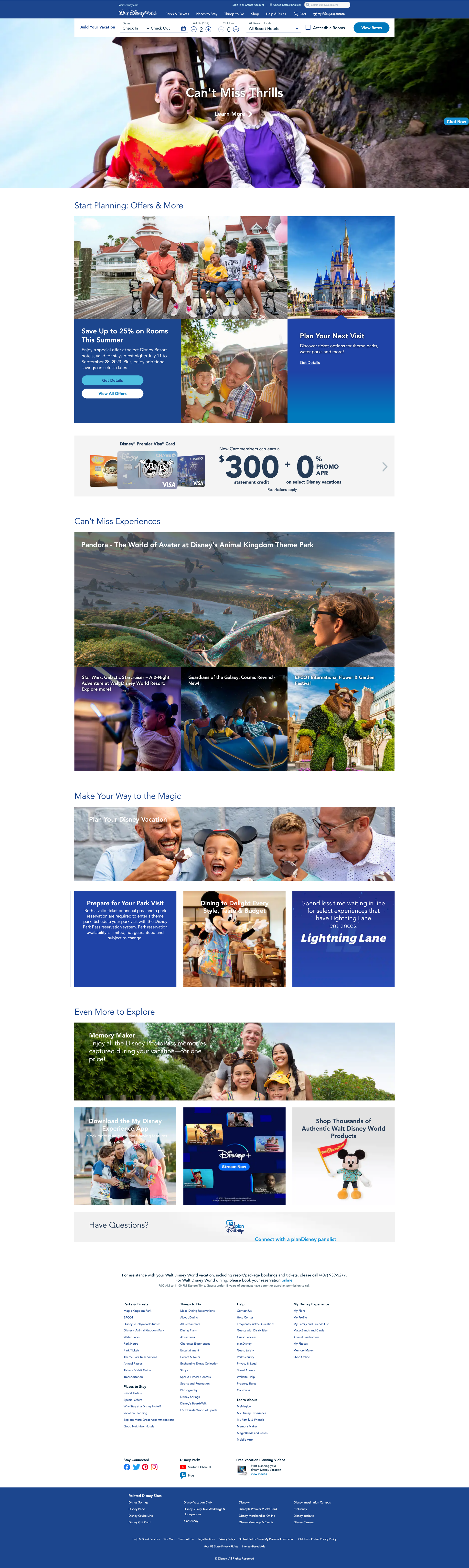
Disney's Florida theme park webpage didn't appear as "magical" as expected. I decided to reimagine the site with more flair and a layout that improves scanning.
FIRST EDITS
First Impressions
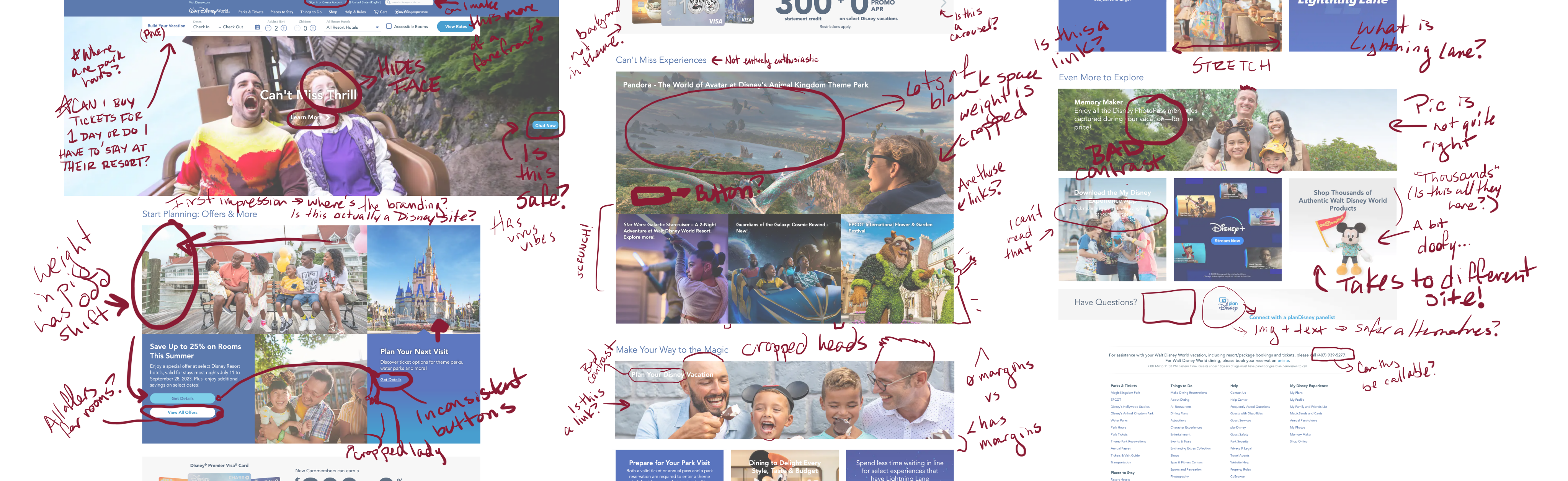
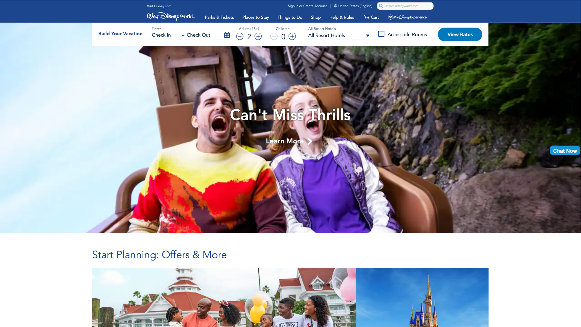
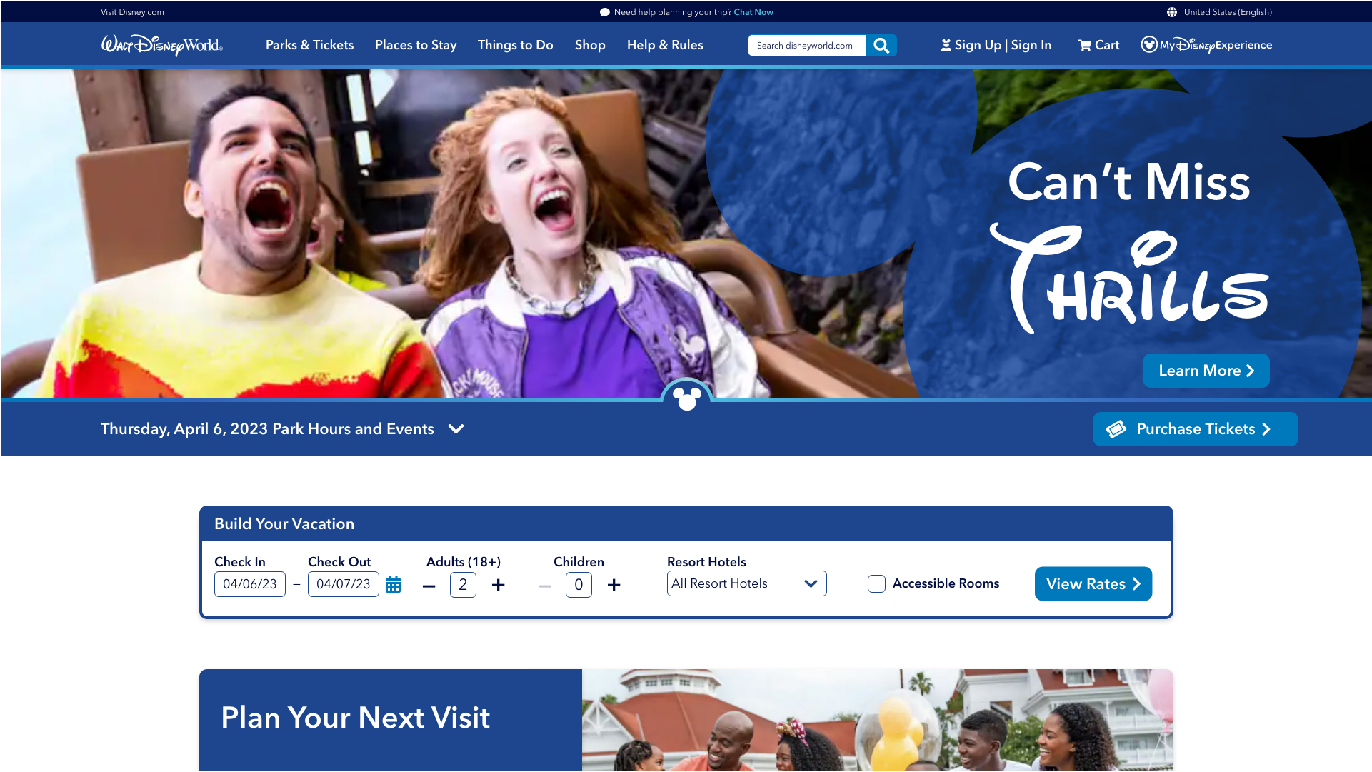
My sister had mentioned a trip to Disney, and I checked its site out of curiosity. But, instead of reading about all the new rides and festivals, I was distracted by the site's interface. Low-res family photos obscured by text, confusing links, inconsistencies... Considering Disney is a multi-billion dollar corporation, I was a bit confused by the state of the website. So, I attempted to bring the home page a little closer to par.

Picture Perfect
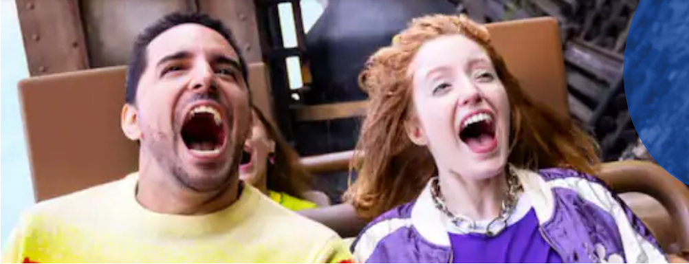
Generally, subjects in images should be treated like text: they should be easy to identify, they should not be obscured, cropped, or stretched, and, if at all possible, they should avoid having too little of a resolution.
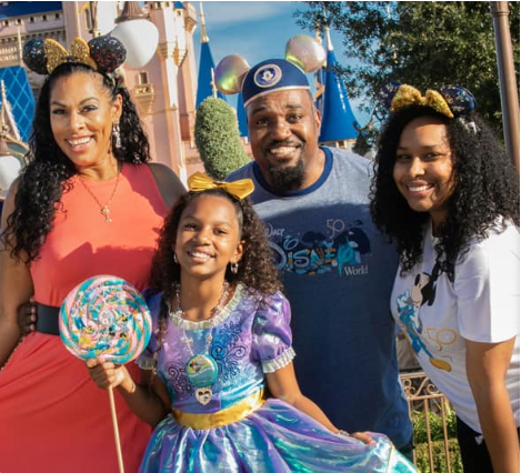
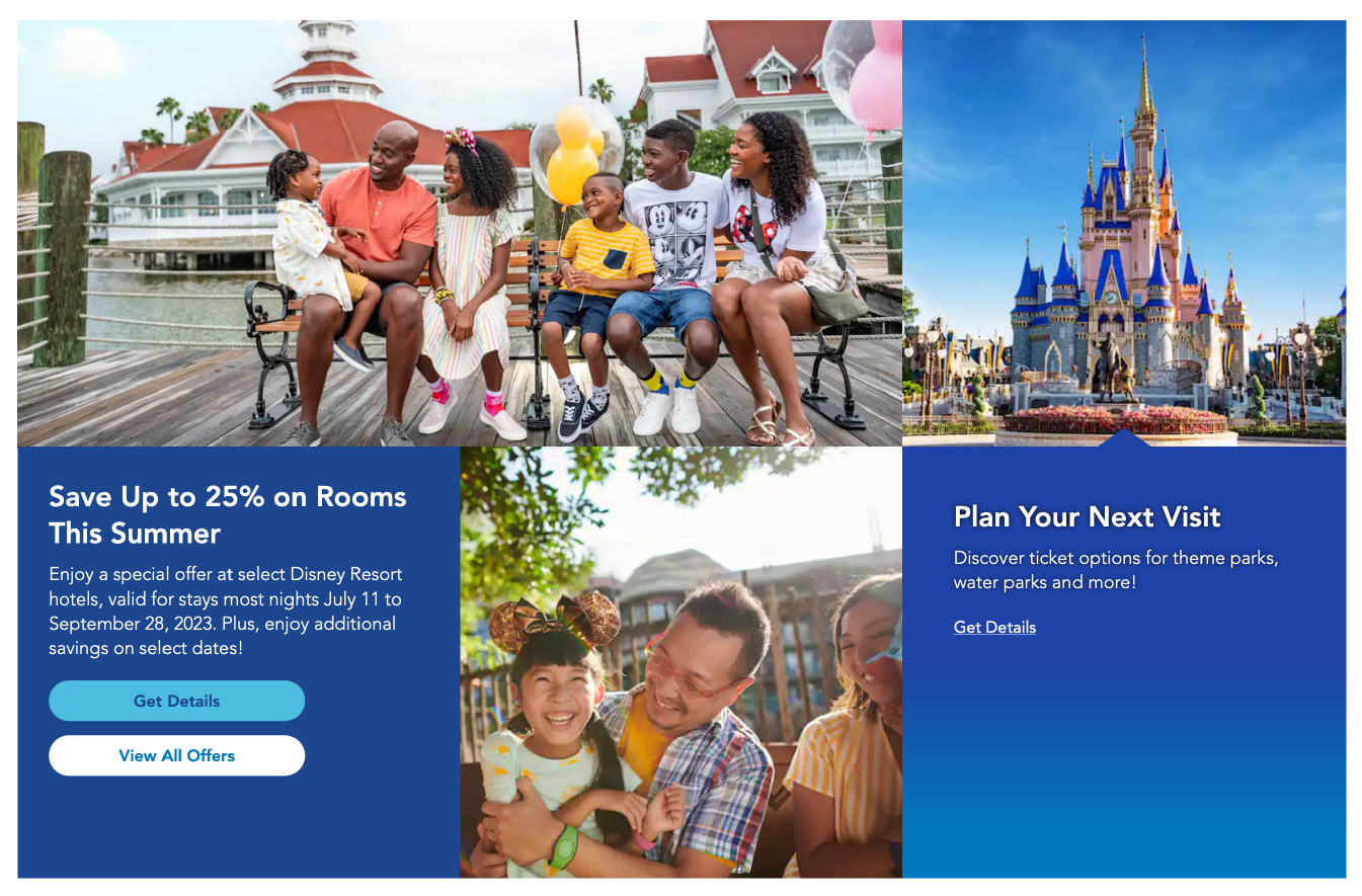
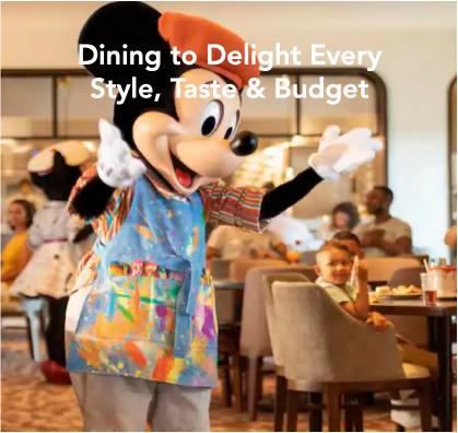
Many of the images on this front page do not work well as background images in the divs. Faces are obscured by text. Heads, chins, and family members are cut out of the frame. Some of the images have to stretch or squish to fit their container. Several images have resolutions that are a little too low; it is a good practice to keep image files small, but it shouldn't be at the expense of the experience.
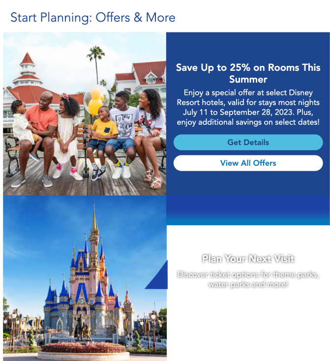
I searched for appropriate images to replace some of these examples, looking for images with higher resolutions (at least, as best as I could find) that can center well and can correlate with the text content.
Instead of cropping people from the frame, I chose to retain a similar aspect ratio from web to mobile view, so no one gets left out.
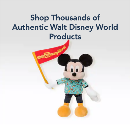
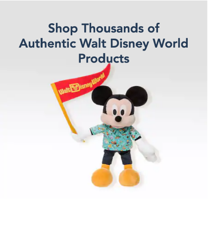
I also replaced the shopping photo with something that better reflects "Thousands of Authentic Walt Disney World Products", while keeping with the family photo theme. The single small mouse may have been fun and quirky, but it doesn't do enough justice to accurately represent its statement.
Margins, Hierarchy, and Visual Flow
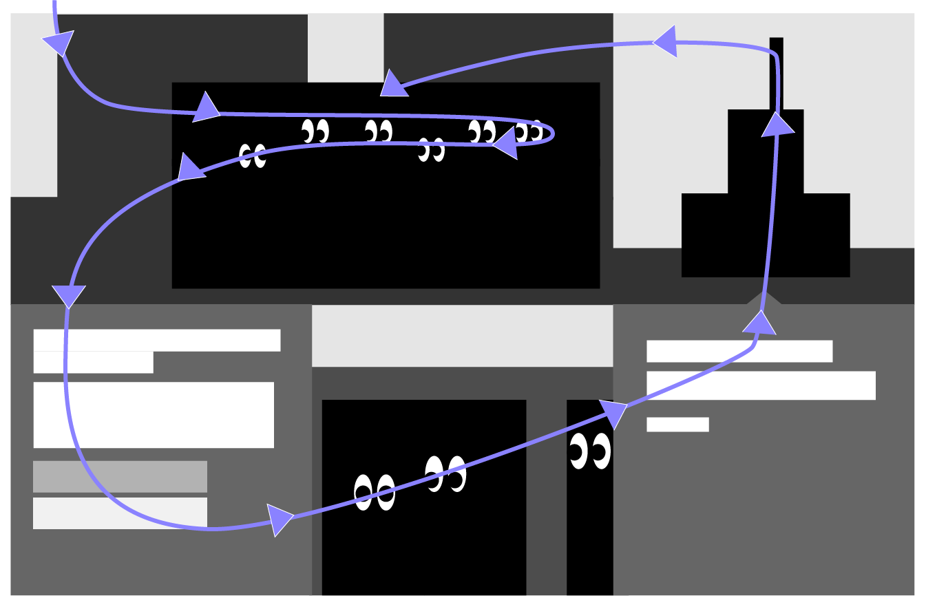
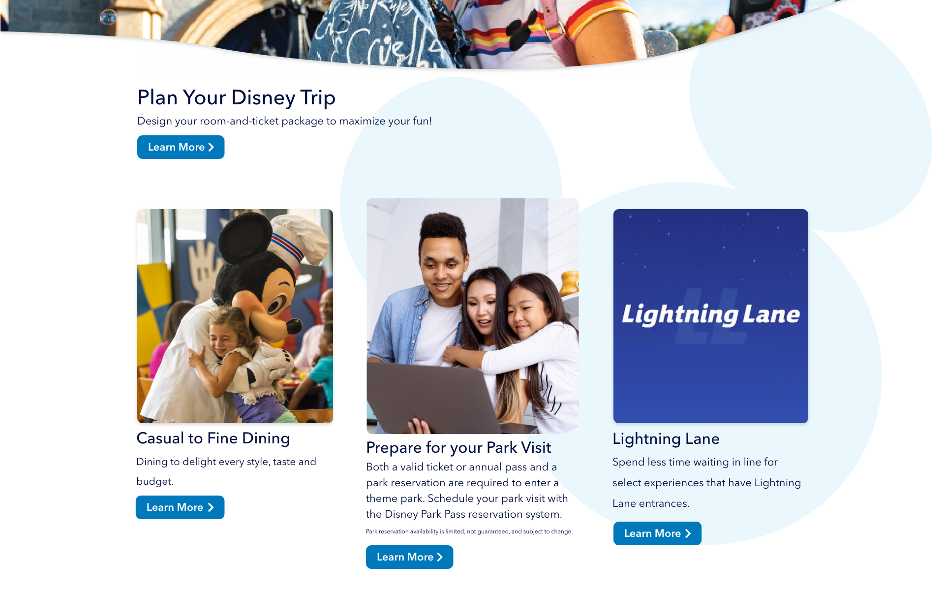
The margins in the first two main sections are not the same in the last two sections. The last two sections offer some breathing room, while the first two feel a bit scrunched. This makes the no-margin sections appear a bit visually chaotic with all the different images, and the visual weight of the large information-heavy container prevents a smooth flow through the site.
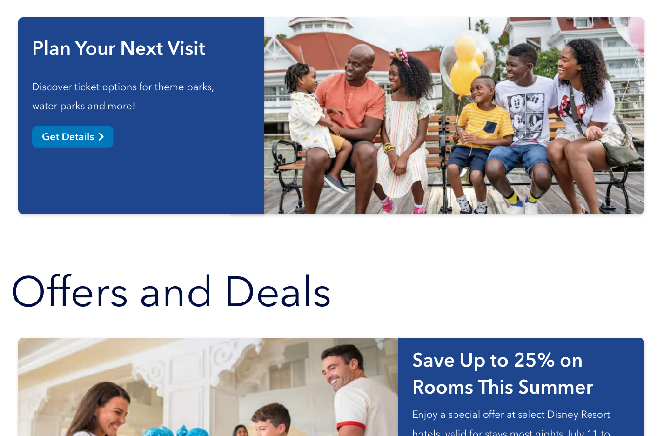
Adding more white space around the divs and sections give the items some breathing room. Also, the amount of articles in the section can vary because they no longer need to fit in a strictly-styled container.
The first section also has an issue with flow. This heavy section of information moves the eye cyclically, and the biggest culprit is the blue arrow on the bottom right block, as it leads the eye back up through the castle. Also, since the composition of this section is non-traditional, the eye is more inclined to follow the gaze of the people in the first picture, which further complicates the scanning process. Breaking this section up and adding more white space lets the user easily scan through the content and progress down the page.
Making Content Easier to Read
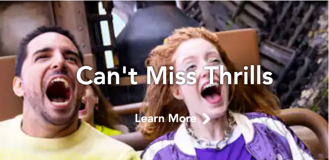
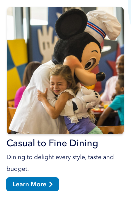
I moved the text content off of the images so that nothing is obscured. White text over colorful images is a bit tricky, even if there are black text-shadows, just because an image may have a variety of contrasts which would make it difficult to read.
I also reduced the amount of words in the headers and gave all the divs paragraphs to provide a more organized, hierarchical structure.
This layout also helps for writing content, as now there is more space to work with without worrying about the text's interaction with the image.
Defining Call-to-Actions
Along with changing the images and moving the text, these divs could make use of call-to-actions, buttons, microcopy, and other elements to help inform the user what to click. For the original site, I didn't know what was clickable, why buttons/links looked different, or what links took me to a different site.

I made consistently styled buttons throughout the page so the user knows where to click. If there isn't a button, the link color is the same as the button color.
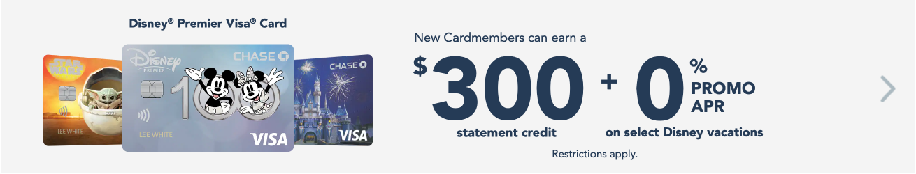
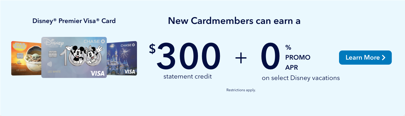
The Premier Visa ad's button looks like it switches through an image carousel. Replacing the arrow with a button and a call-to-action helps guide the user.
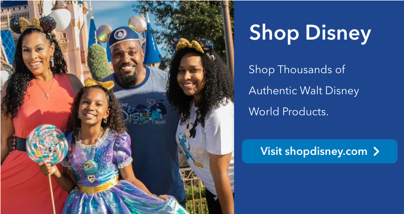
The shopping link actually goes to a different site. Explicitly saying "Visit shopdisney.com" helps let the user know the link's direction.
I also provided a ticket icon to the purchase tickets button, so users may quickly scan and find the (probably) most important button on the site.


And, before I completely redesigned the "Free Vacation Planning Videos" icon in the footer, I found that the link did not take the user to free vacation planning videos. Rather than confuse things, I removed it.
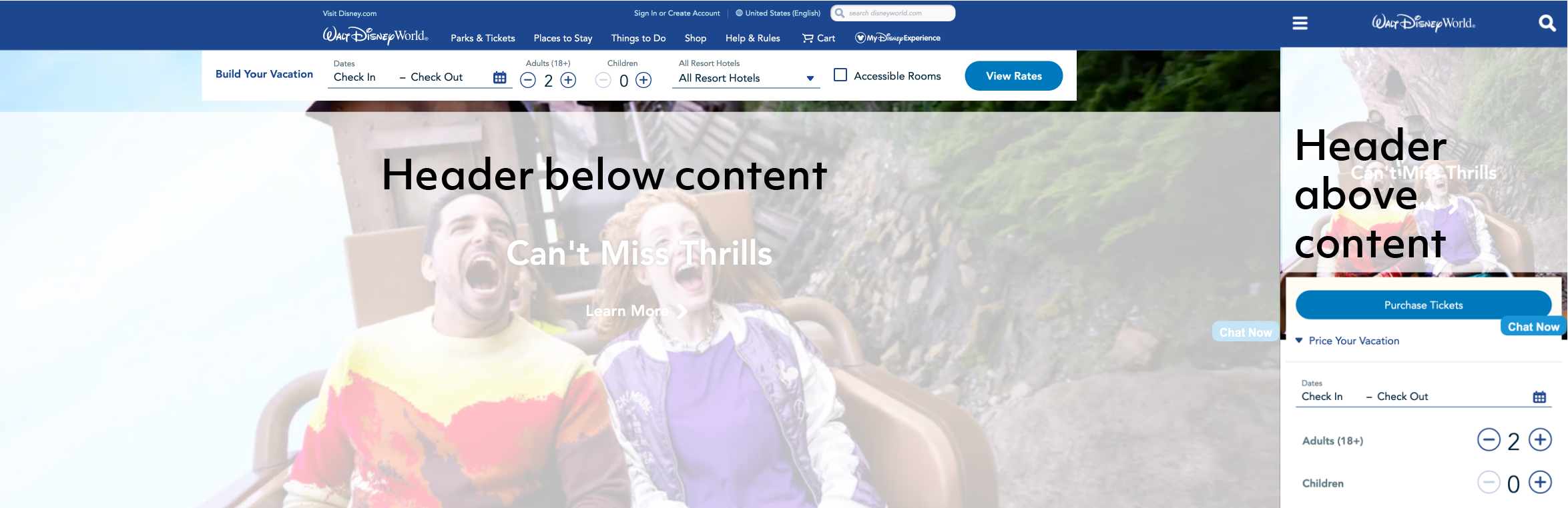
No Fixed Chats!
Ok... maybe I'm channeling my inner Edna Mode here, but generally, users find fixed sidebar chats to be annoying. They cover up the content, they're distracting, and, since spam ads often live on sidebars, they look like they lead to viruses.
This button doesn't look trustworthy. "Chat Now" doesn't offer much clarification as to the chat's purpose. Also, this specific button is not styled the same throughout the site.

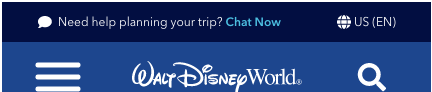
So, I moved the Chat feature to the very top of the navbar, and I included a bit of microcopy and a chat icon to direct users if they need to chat. It remains constantly present in both web and mobile views, but it doesn't disrupt the flow of the page.
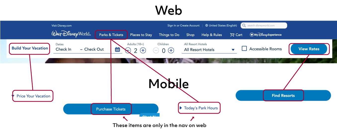
WEB V. MOBILE
Consistent Content
Text between the web and mobile views are not the same. "Build Your Vacation" becomes "Price Your Vacation", the link differs between "View Rates" and "Find Resorts", and there are even some inconsistencies in the footer.
In web view, there is no readily available "Purchase Tickets" option, whereas the button is front and center in mobile. Also, park hours are not listed in the web's main page.
Consistency helps make seamless transitions between web and mobile views so users can quickly scan and navigate through the page.
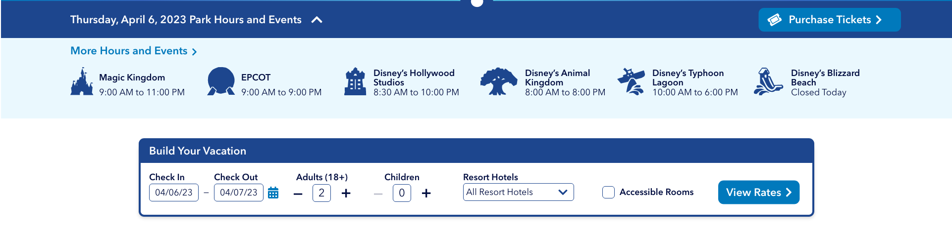
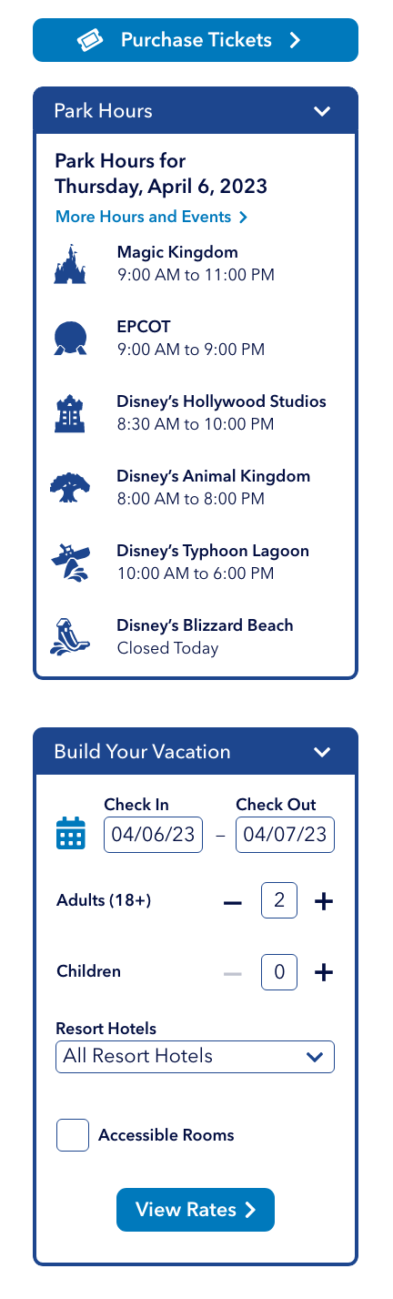
Shifted Items
In wanting to maintain consistency, I moved both the Park Hours and Build Your Vacation sections underneath the hero image header. This also helps with breakpoints, for users who might want to shorten the window size, so that these sections stay in their relative spots.
Breakpoint Issues
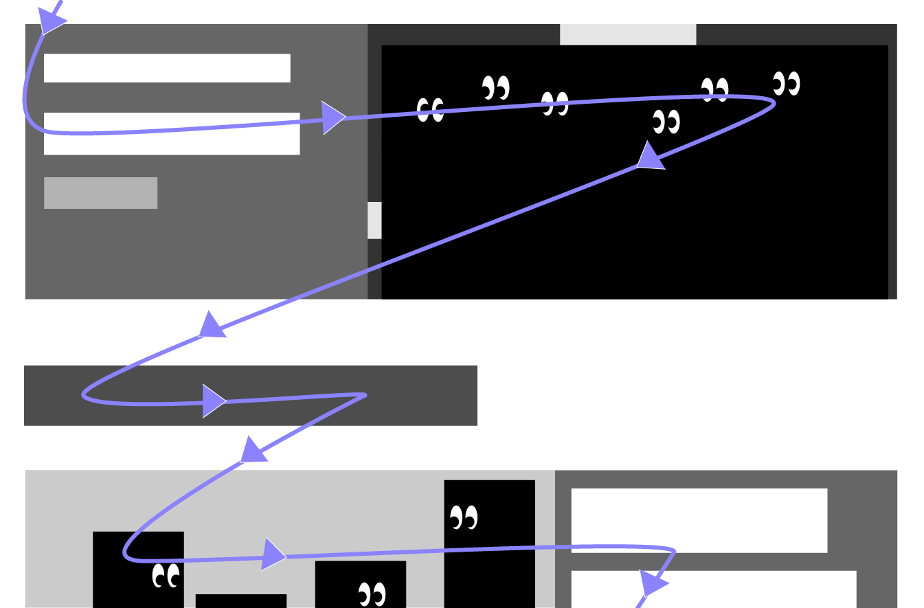
I already redesigned the Start Planning section by adding white space, but there are even more issues surrounding the original block. From 568-767px, content spills out of the container, the flow is disrupted, and the arrow doesn't point in the right direction. Since the items are so interconnected, they are difficult to manage, especially for breakpoints. Separating the blocks makes them more manageable.
The planDisney panelist section is also tricky. From 768px and up, the content struggles to align, and the link even gets partially cropped out of the container. I rearranged the content, making the image bigger and separated from the text. Sometimes images and text get finnicky with positioning, so separating them into columns should make alignment through all breakpoints easier.

Adding Magic
Where's Disney?
When I first visited the homepage, I didn't think I was on a Disney site. Disney has set such high branding standards for itself that anything less than the patented magical motifs and Mickey Ears comes across as non-Disney. Some of the other pages encapsulate the magic well, but this front page feels a bit... Wordpressy. So, I broke out the magic wand and got started on branding.
Mouse-ification
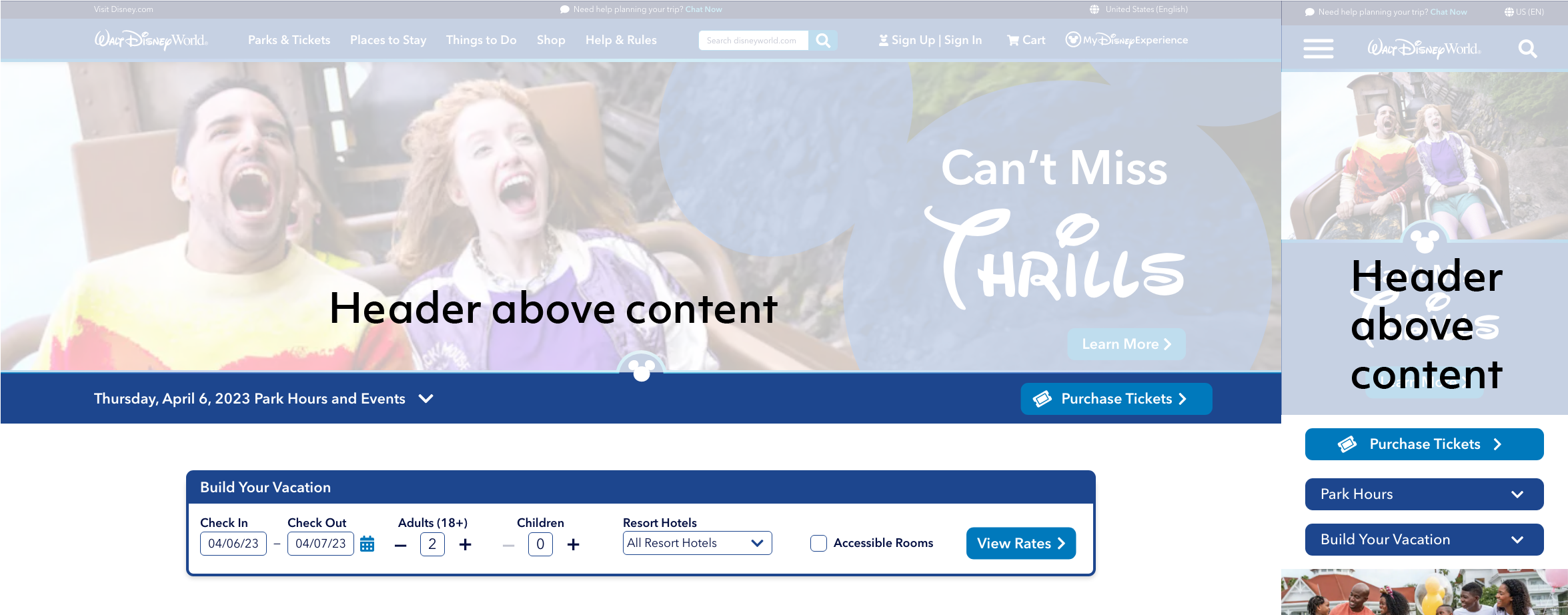
To give the hero header some pizzazz, I added a Mickey Mouse background to the words and rearranged the elements so the people weren't hidden behind the content. I also framed this header with a couple of gradient lines, and the lower line includes the Mickey emblem.
New First Impressions
Drag the slider to see the UI comparison between the original design and the redesign.
More Mice
I also added a couple of light blue mice behind the main content. This helps provide just a touch of interest without inundating the user with too much visual information.
A little mouse poking through the footer completes the page with some playful branding.
And, along with these mice, I redesigned a couple of icons. The Sign Up user icon is wearing a Mickey hat, and the Disney blog circle has ears.


More Magic
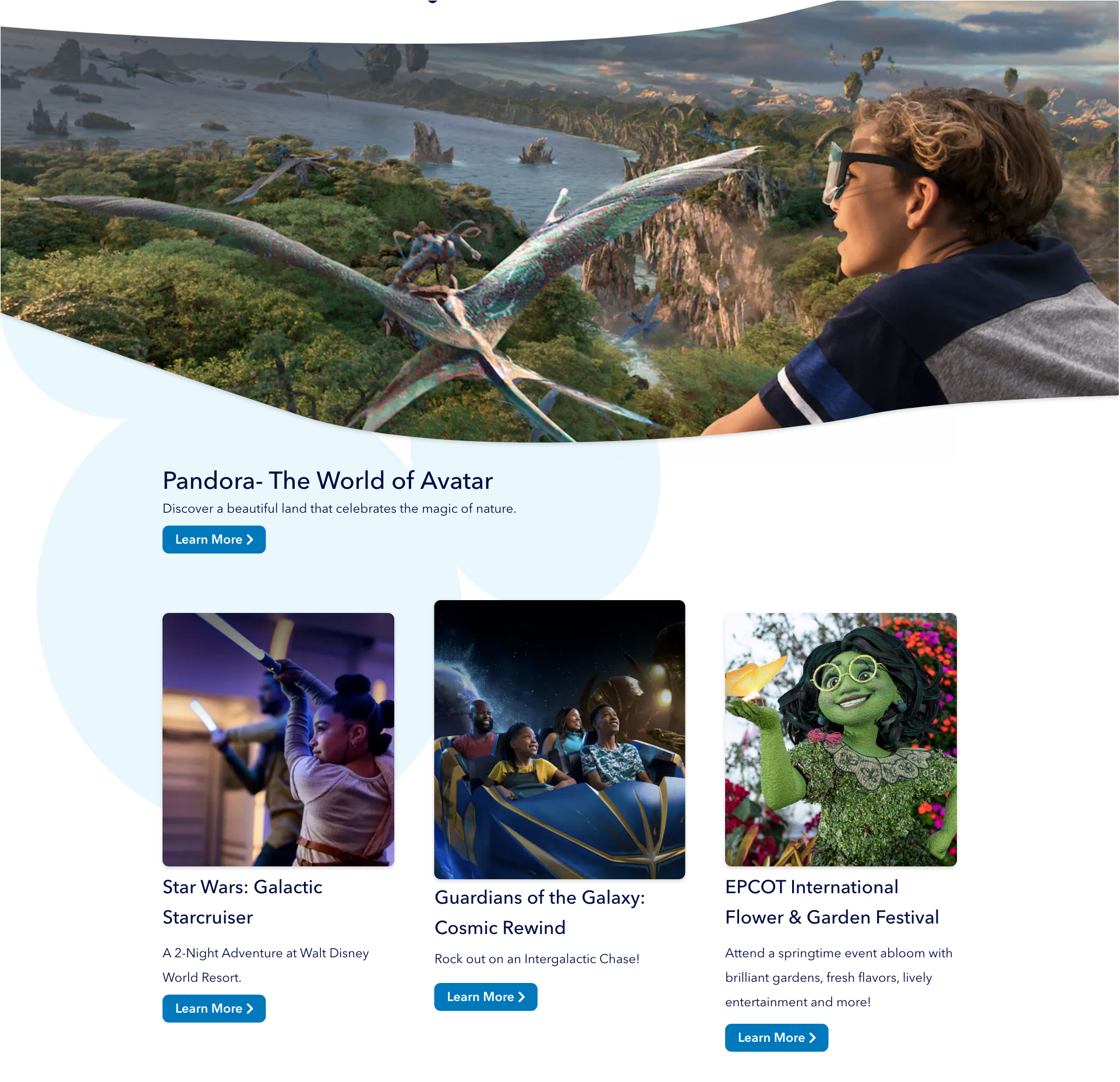
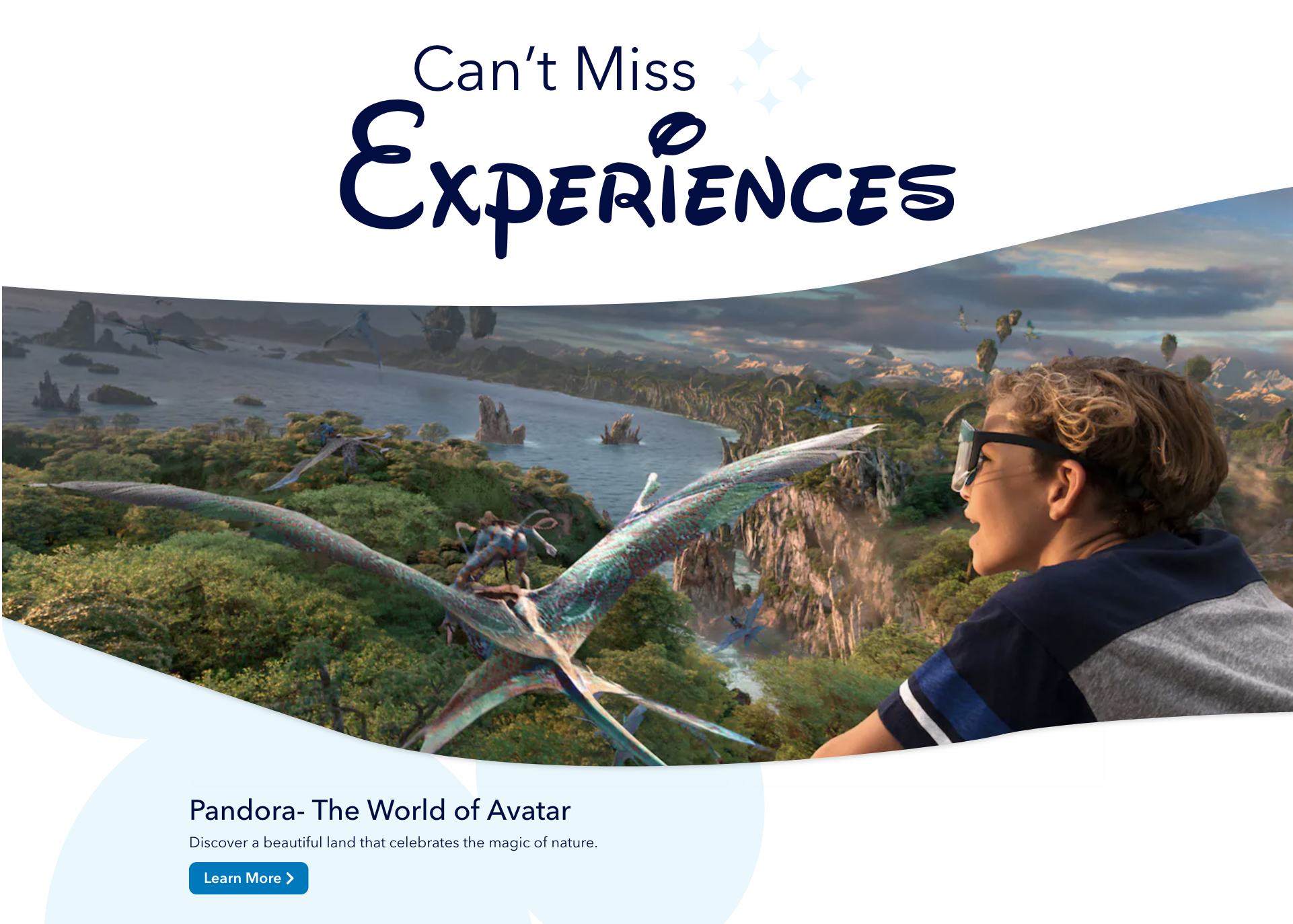
The small Avenir headers were a bit lackluster. Waltograph is a font based on Walt Disney's signature handwriting, and this helps tie in the Disney branding. Making large, bold headers helps break the content and provides better hierarchy. I also added some sparkles to give some more magic.
And, inspired by Disney's Genie App page, I gave the header images for "Can't Miss Experiences" and "Make Your Way to the Magic" a full-width organic flow shape, rather than repeating simple rectangles. This helps portray the larger-than-life experiences to be made at Disney. Since the rest of the site utilizes whitespace or subtle light decoration, these large images don't feel in competition with the other images.
Disney World
Disney World's site is a little bit of everything. Some pages are modern, some are outdated, some are fine, and some are in need of some redesigning. There are many small differences throughout the site, such as button design or page names, that could confuse the user. Changing these small inconsistencies, incorporating a playful, but not overwhelming, branding presence, and designing for accessibility and practicality could greatly improve the Disney World site.


This project uses copyrighted material in an effort to accurately portray a possible redesign of disneyworld.disney.go.com. This project is protected by Fair Use under Section 107 of the Copyright Act, in that the project is for educational purposes through practicing and improving design, and the project also offers critical analysis of an existing website. This project does not intend to profit from any of the copyrighted material from Disney or its affiliates. Any other imagery outside of Disney copyright is Creative Commons 0.