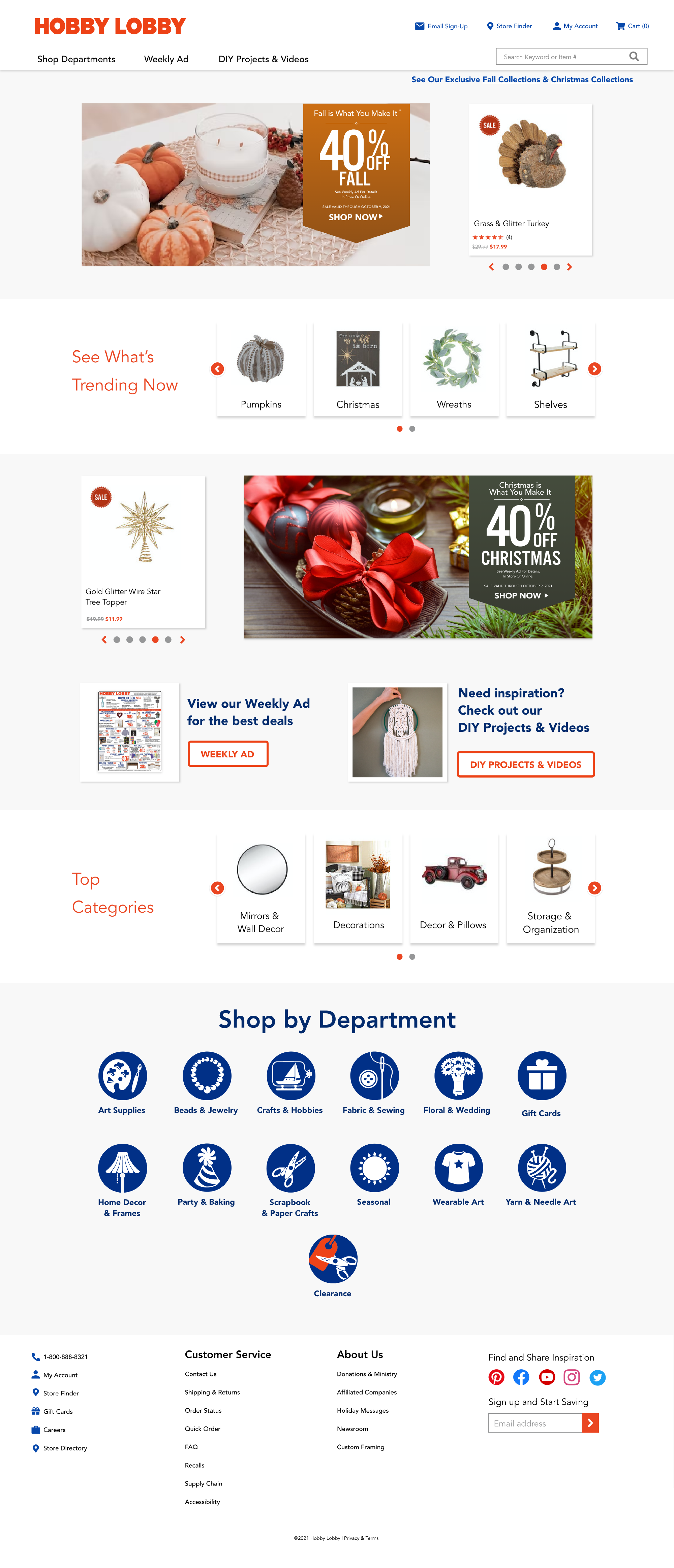
6+ fonts. Minimal interactivity. Hobby Lobby could use a little facelift.
Hobby Lobby, despite having over 900 stores across the US, has a surprisingly outdated website. For this UI case study, I gave the site 3 redesigns: one for subtle changes, one for modernizing, and one for just a bit more spice.
CLEAN UP
What Stands Out
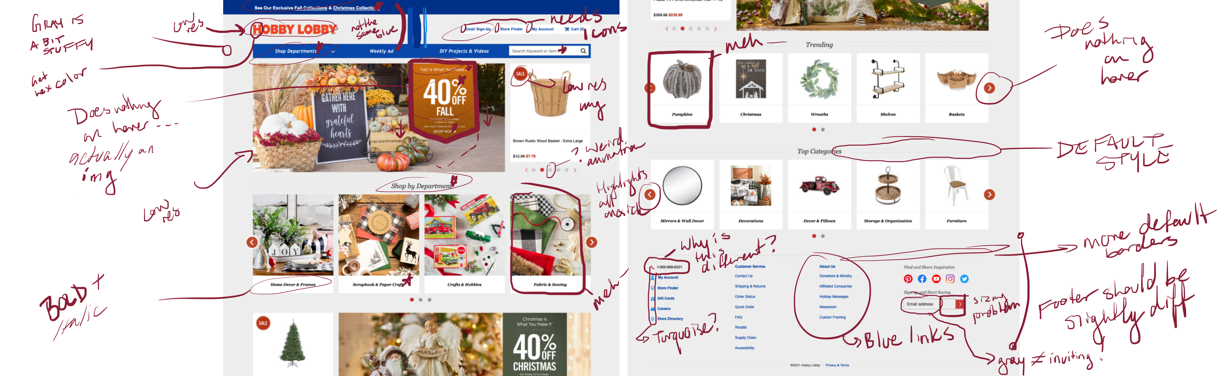
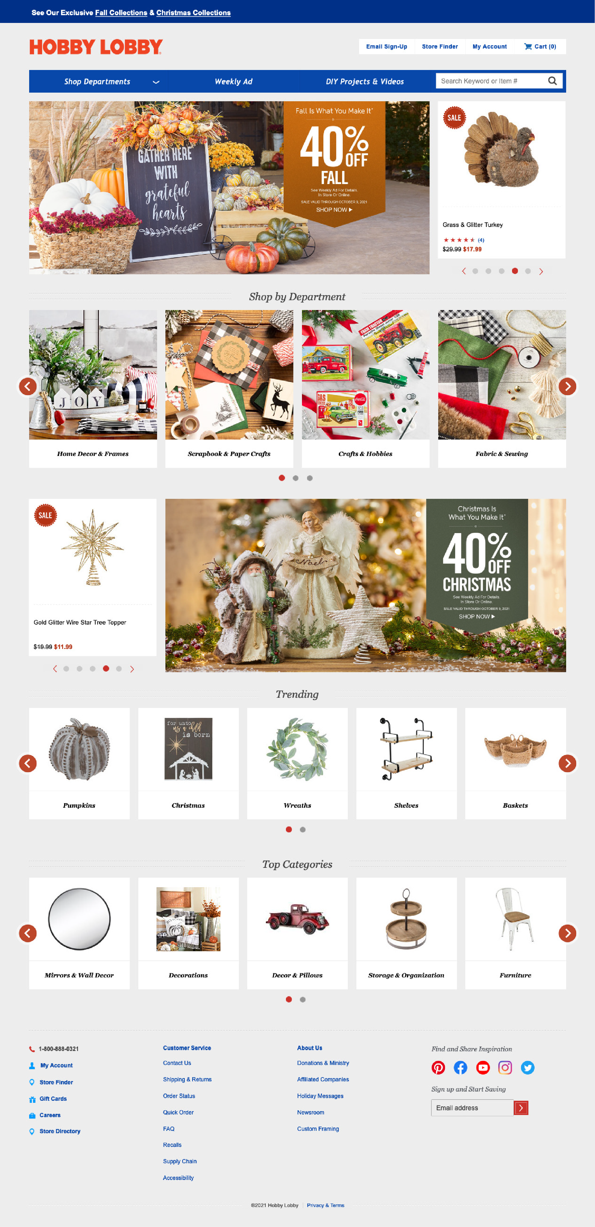
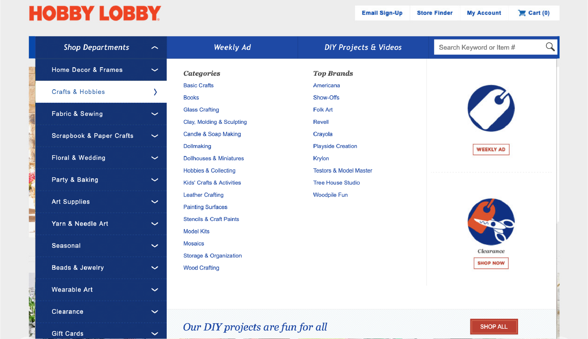
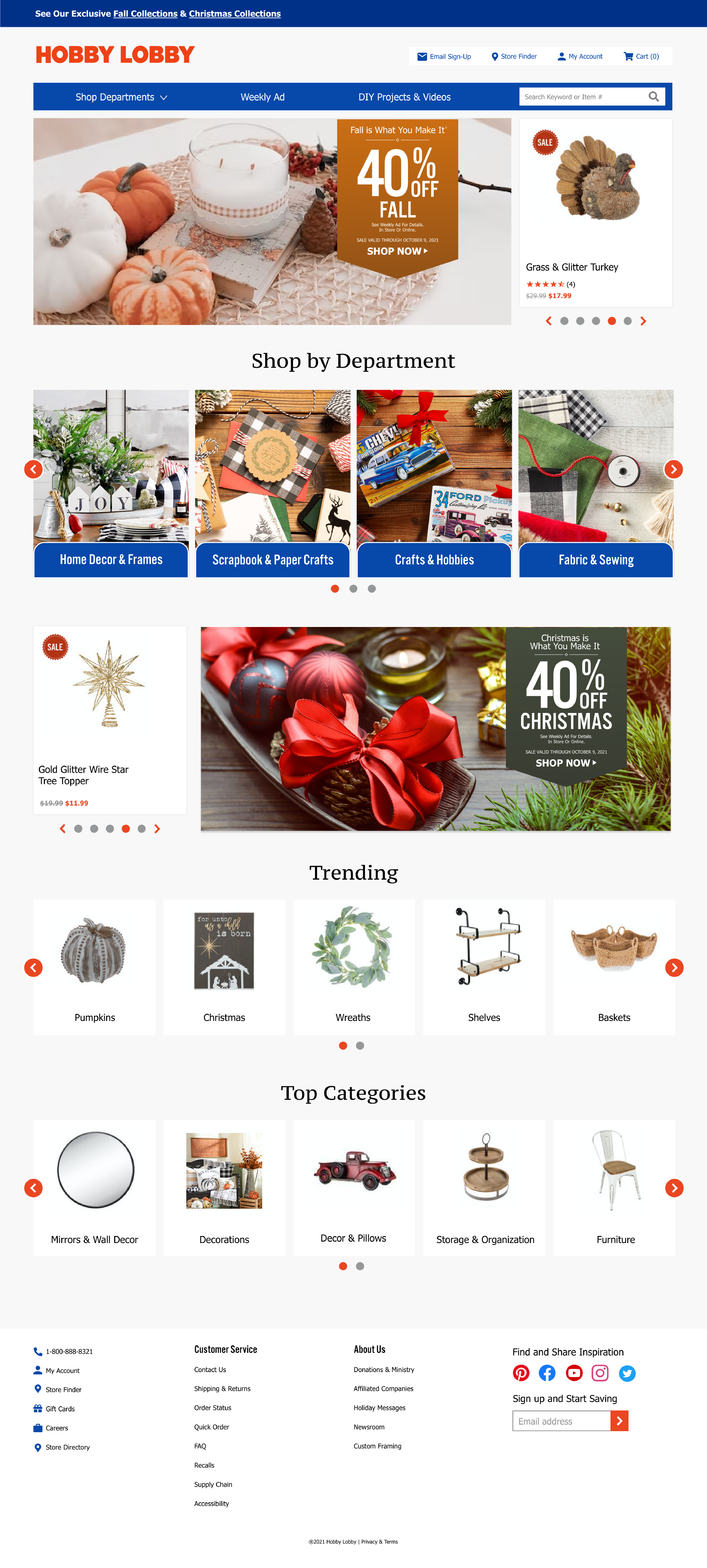
Hobby Lobby's website holds on to quite a few outdated design styles that, in comparison to today's preference for sleeker interfaces, makes this site look like it hasn't been updated in a long time. A few items that stand out the most:
- Italics
- Too many fonts
- Default-styled borders
- Limited interactivity
- Low-resolution images
The Subtle Approach
Before I started wiping the slate clean, I wanted to see the difference that little tweaks could make for a design. Users generally aren't too keen on sudden, drastic changes, so taking steps towards a complete redesign would help ease them towards the change.
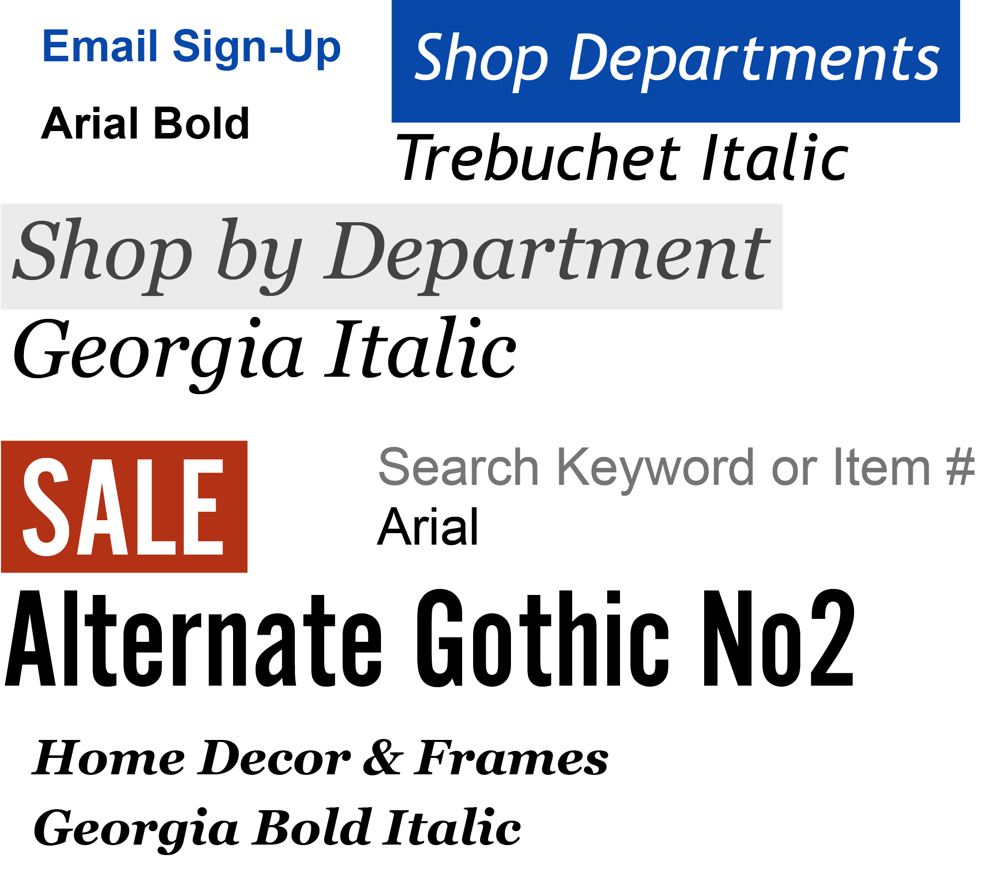
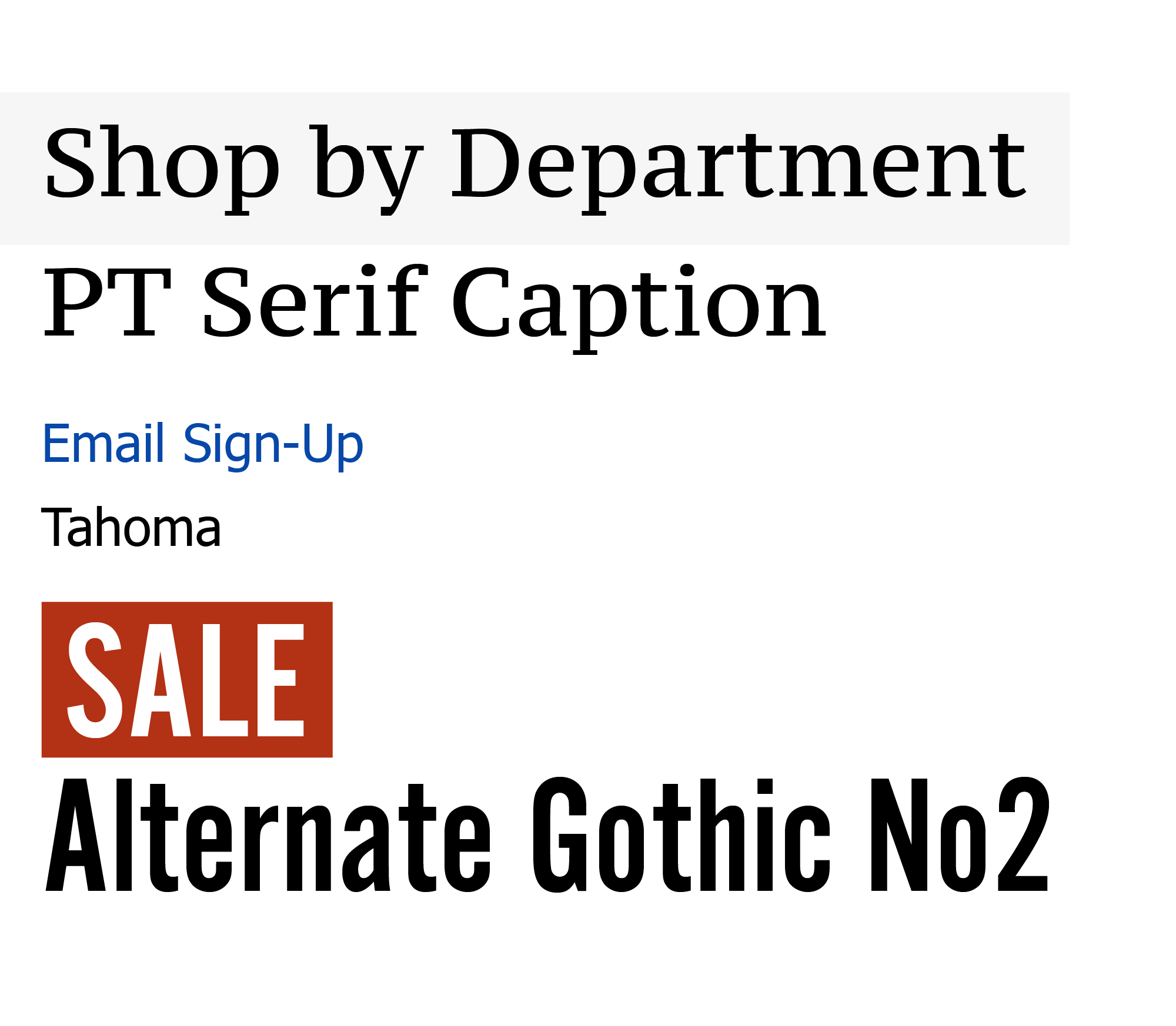
Fixing the Fonts
Courier New, Verdana, Arial, Georgia, Trade Gothic, Corda, not to mention condensed, bolded, and italicized styles!
The general rule is to pick 2-3 fonts and stick with them. Here, I've chosen Tahoma (for general use), PT Serif Caption (for main headers), and Alternate Gothic No2 (for secondary headers).
I also removed all the italics. Italics should be reserved to emphasize or convey special information.
Adding Interactivity
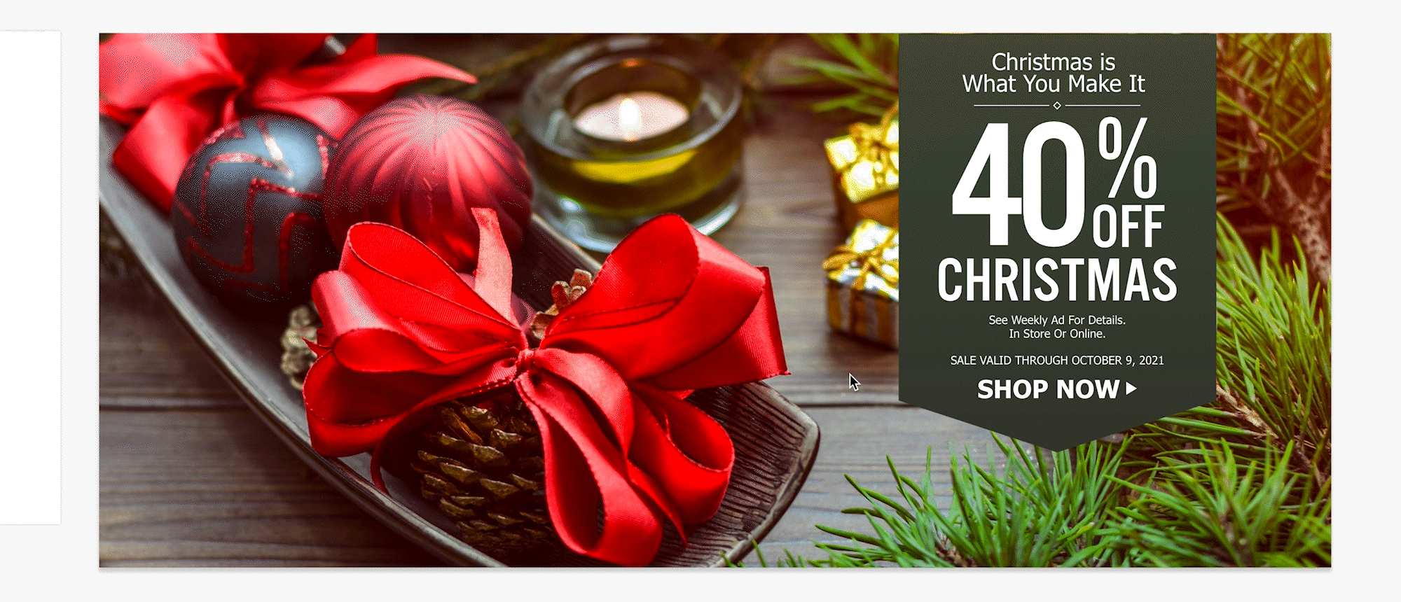
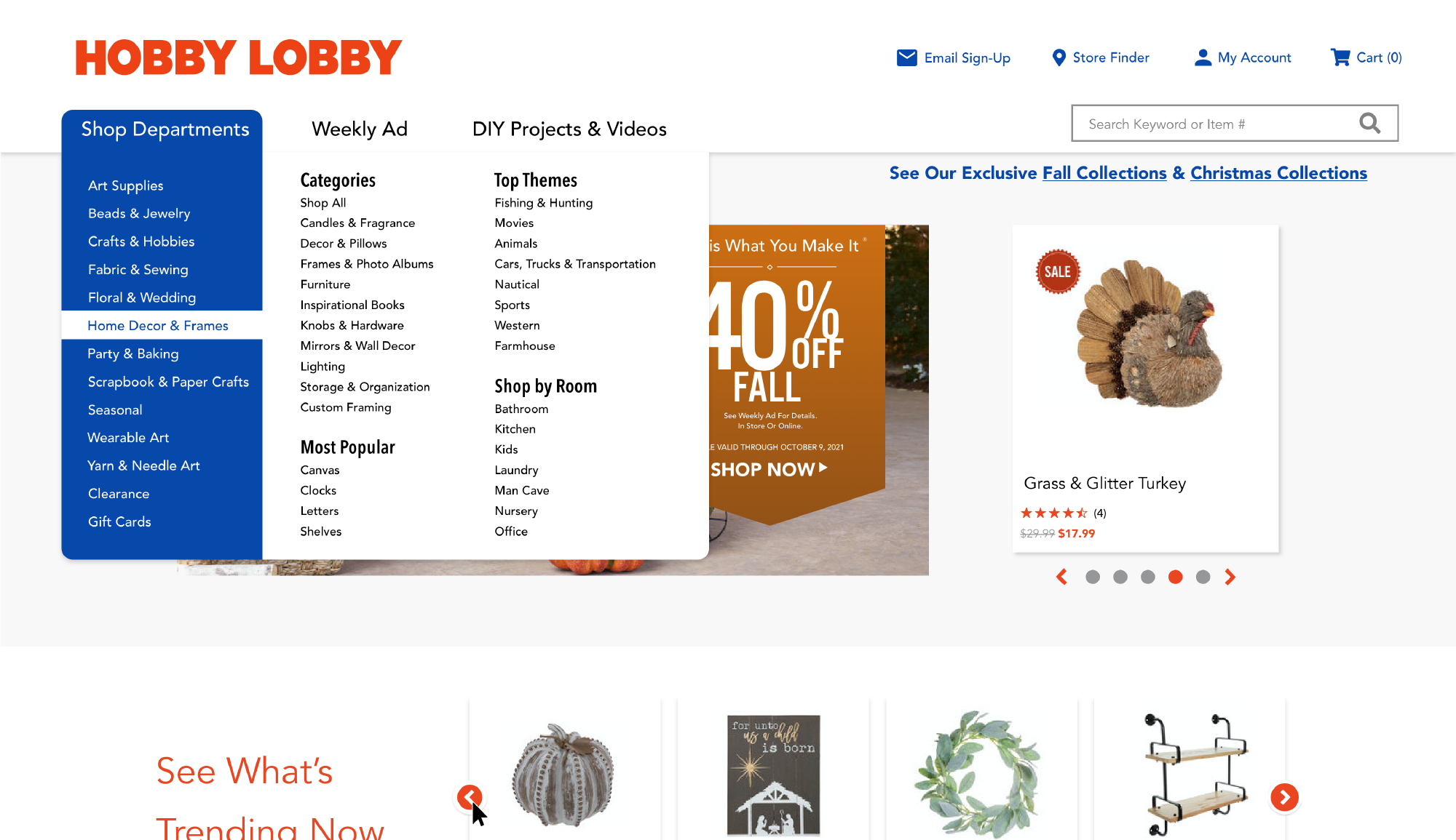
At first, I thought the 40% Off banner was a div that did a hover effect, and I was a little disappointed to find that it's actually just part of the image. So, to give it a little more interactivity, I had it drop down a little when it's hovered.
The arrows are also static on the site. So, I made the border slightly increase when it's hovered by the cursor.
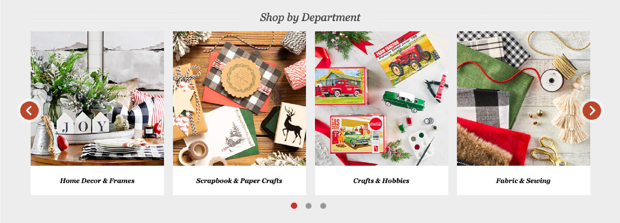
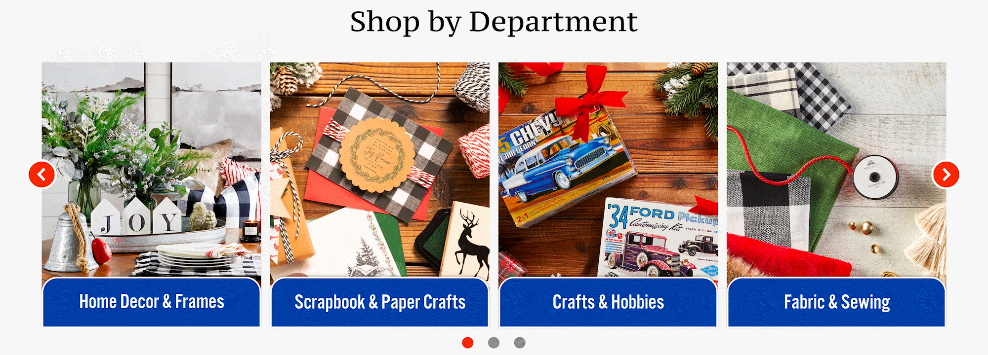
I wasn't sold with the original version of the Shop By Department cards. They appear unfinished. So, I tried adding some color and hover effects.
A Little Goes a Long Way


Drag the slider to see the UI comparison between the original design and the redesign.
Along with some other minor changes (brightening the background, adjusting the color scheme, adding more icons), at first glance, nothing looks too dramatic. But, in comparison with the original site, just the font changes alone make a big difference.
Modernizing
Good. The site is slowly getting up-to-date with some subtle redesign. But... it could go a lot further than just that.
What Do Other Sites Do?
The first redesign might act as a good transition into a better design, but it's still not up-to-par with today's standards. I modeled the next redesign after browsing through popular commerce sites, like Macy's, JCPenney, and Michael's. Although they don't appear as "homey" as the original site, they are cleaner and more open, making good use of negative space.

Simplified Menu
I removed some repetitive items from the menu, simplifying it for easy navigation.
New Section
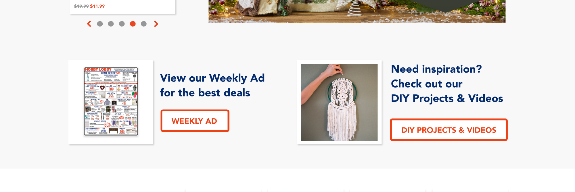
What I did remove from the menu, I added to the main content. This gives the Weekly Ad and the DIY Projects & Videos links a highlight.

Reducing Visual Noise
To simplify the amount of fonts, I changed the fonts again to a cleaner sans-serif. Actually, except for the 40% Off banners, everything is Avenir. From Book to Medium to Bold, single fonts can have the diversity of several fonts, and consistency contributes to cleanliness.
I shifted the departments to the bottom of the page and replaced their images with icons. Although the original photos are interesting to look at, they are complex and appear to clutter the page with excess visual information, making it difficult to quickly discern what they represent.

Bringing it up-to-date
Reducing the amount of visuals and brightening the background certainly gives the website a squeaky-clean interface, comparable to the direction many other commerce sites take.
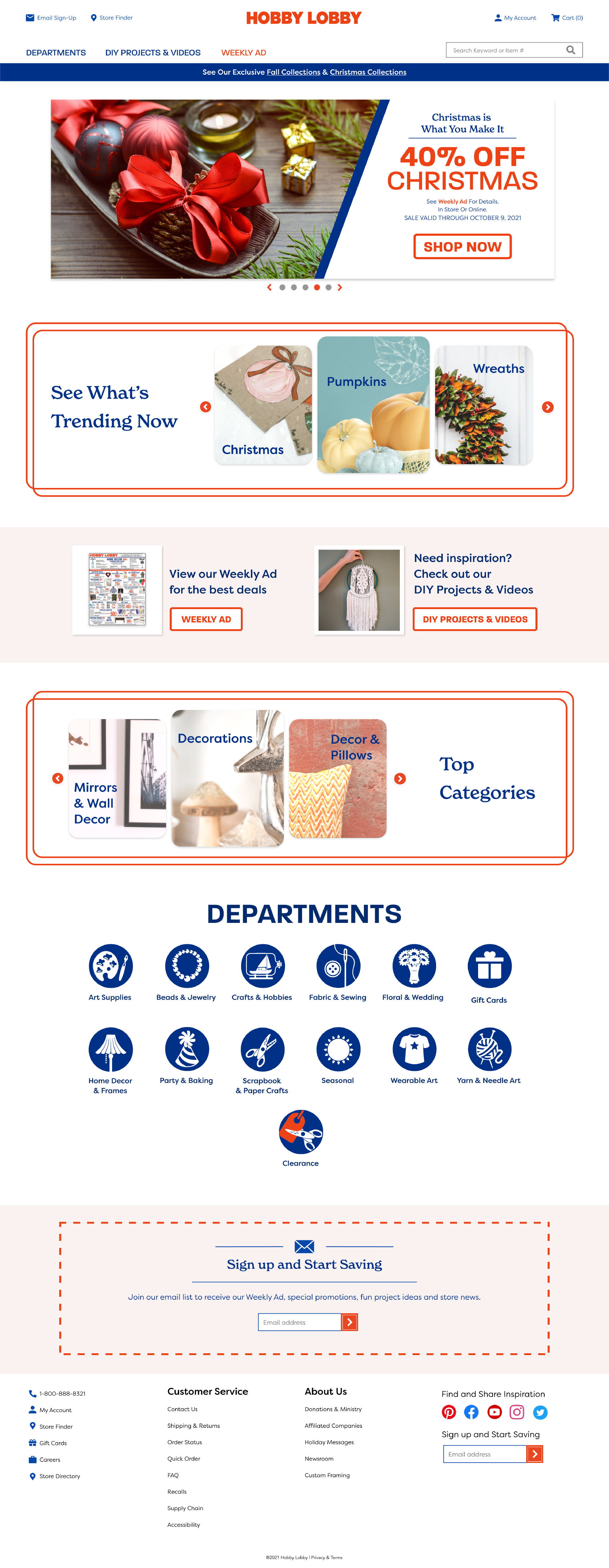
A Tad More Spice
The site's more on par with other commerce sites, but now let's make it unique.
Taking Notes
For this redesign, I wanted to evoke more of the brand's identity and vibe, noting everything from the logo to the interior of the building.


Typography
I sometimes accidentally say "Home Depot" instead of "Hobby Lobby"... although, I suppose "Hobby Lobby" is the "Home Depot" for crafters. It has everything to do with the logo: bright orange blocky letters, "H-O-" as a start. But, I'm not here to redesign the logo. I'm here to translate the logo into the site.
The logo is probably the most important aspect of a brand-- so, I repeated a similar font style* throughout the site. Although not perfect, as the O's are a bit more squared off, it resembles the original Hobby Lobby logo.
*The actual font is Gotham, but I don't have $100, so I used Paralucent.
Since Hobby Lobby's logo doesn't come across as "craft store", it needs a little help with some complementary fonts.
For the general body font, Filson Pro softens the boldness of Paralucent, and its subtle curls in the t's and k's help establish an artsy/crafty persona.

The secondary header, New Spirit, is where the design takes a unique turn. As the original site uses serif to convey a more traditional tone, New Spirit brings in a retro flair that pairs with Paralucent's blocky retro style and Filson Pro's simple crafty style.


Simplifying
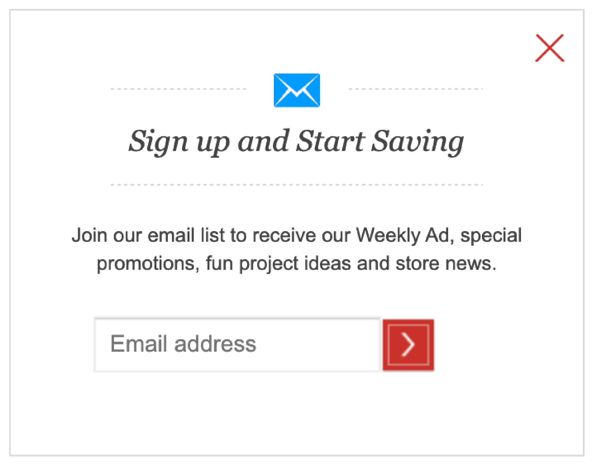
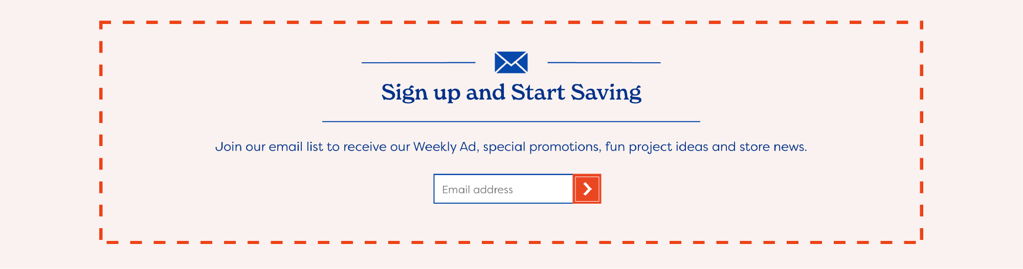
I simplified the site even more by removing the sale items and joining ad content into a slideshow. I did include the email sign-up at the bottom of the page, however. This was loosely styled like the pop-up, though I added more color.
Personality
Little things, from borders to splashes of color, help give the site a little more personality. Along with some interesting fonts, this gives Hobby Lobby a modern, but definable, web brand.
Hobby Lobby
Looking back after designing the 3rd iteration, the 1st redesign is not that impressive. But, compared to the original site, it's still strides ahead. Seeing the progress from subtle to modern, then from "bland" to "brand", shows how amazing little tweaks and edits can improve a site.

This project uses copyright material in an effort to accurately portray a possible redesign of hobbylobby.com. This project is protected by Fair Use under Section 107 of the Copyright Act, in that the project is for educational purposes through practicing and improving design, and the project also offers critical analysis of an existing website. This project does not intend to profit from any of the copyrighted material from Hobby Lobby or its affiliates. Any other imagery outside of Hobby Lobby copyright is Creative Commons 0.